Palette Perception
Topics:
Accessibility
Color
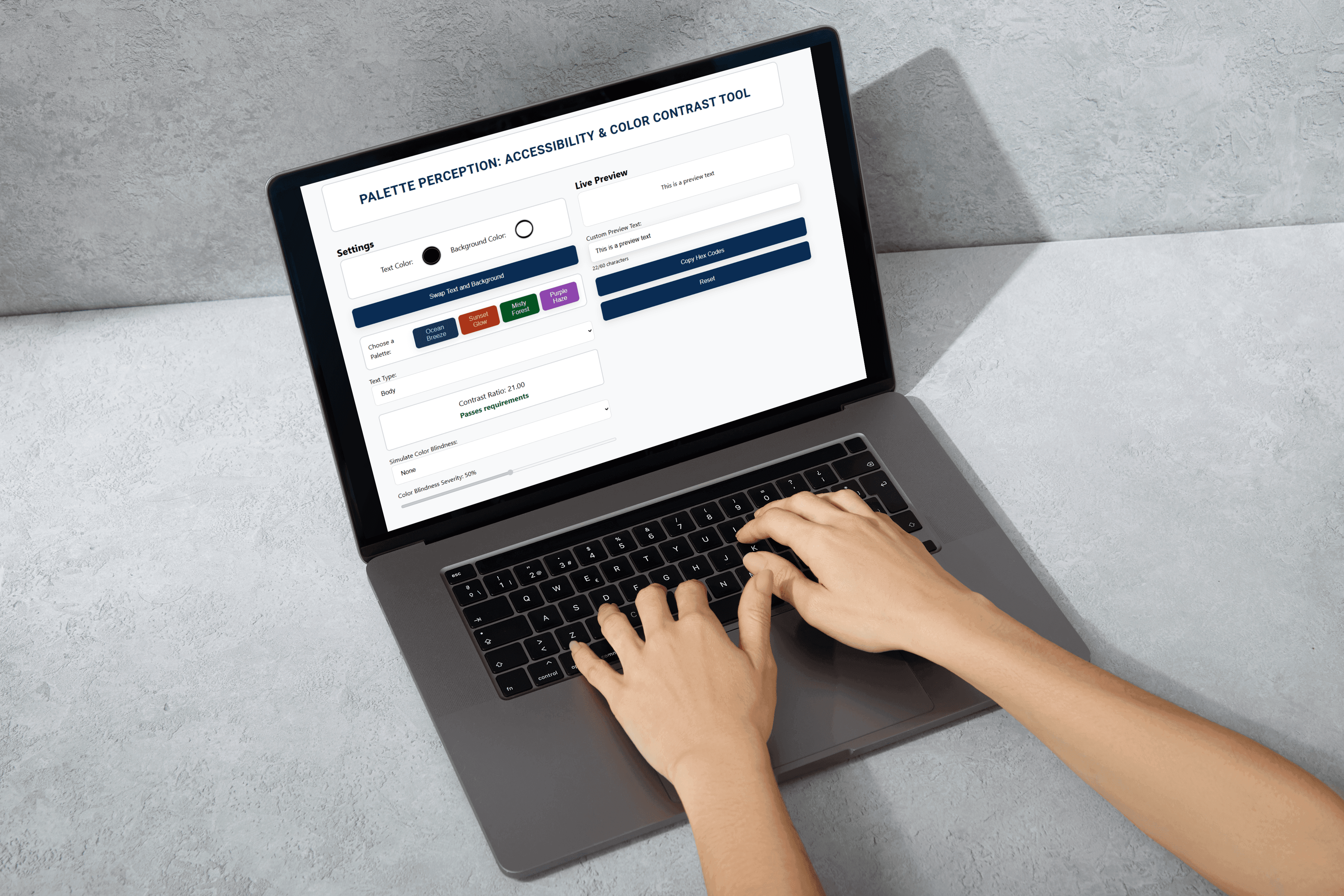
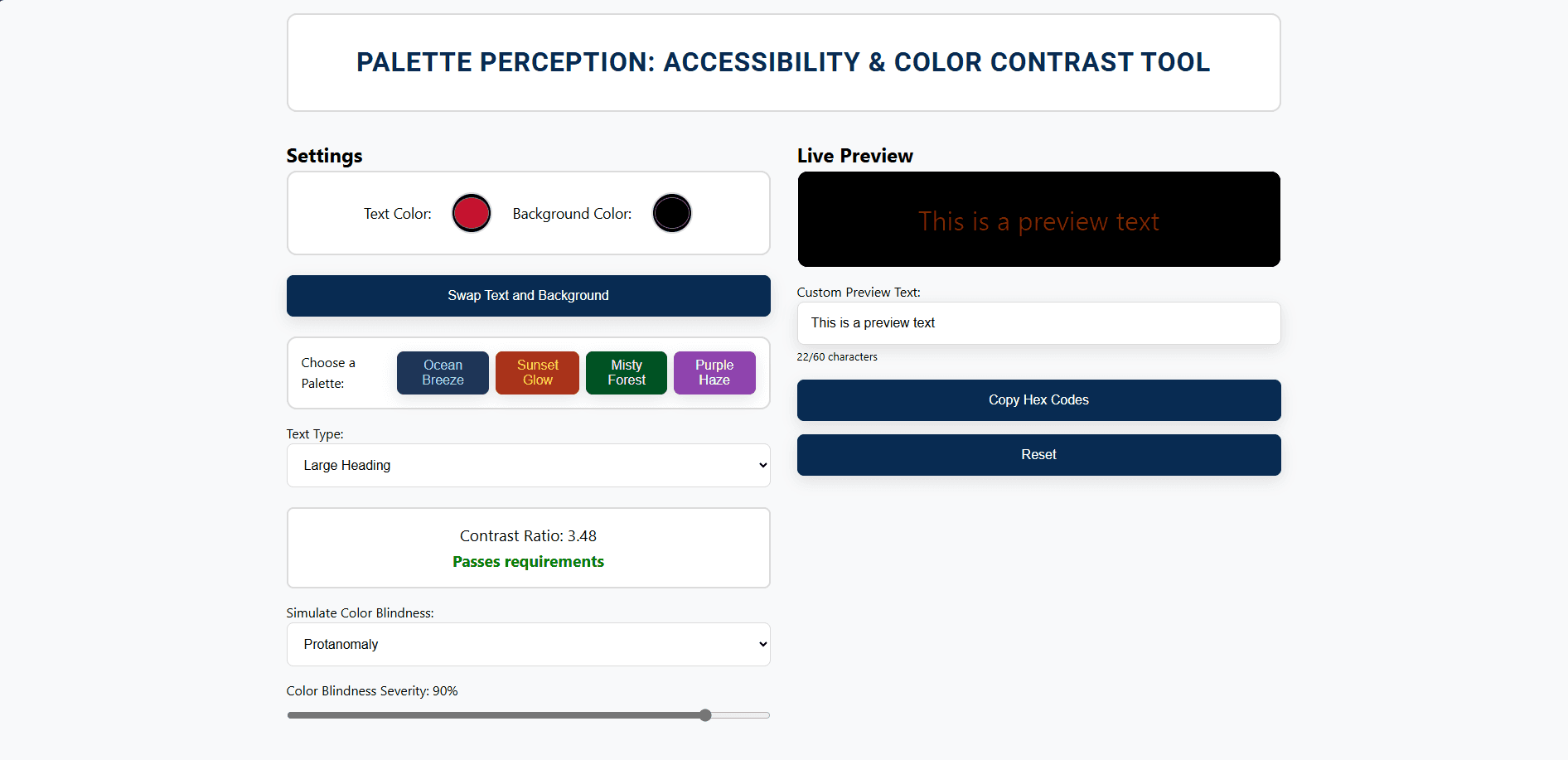
Palette Perception is a tool for evaluating color accessibility, combining contrast checks and color blindness simulations. It offers extensive customization, allowing users to input text and background colors in various formats, adjust text sizing, and modify the type and severity of color blindness. With real-time preview updates, hex code copying, and options to personalize the preview text, it provides a comprehensive and easy-to-use solution for ensuring accessible design. Palette Perception was created as a solo project for the Software Structures (SSUI) class at CMU.
Roles:
Sole designer, developer, researcher
Duration:
Nov 2024 - Feb 2025
Tools:
Figma
JavaScript
HTML
CSS

Palette Perception
Topics:
Accessibility
Color
Palette Perception is a tool for evaluating color accessibility, combining contrast checks and color blindness simulations. It offers extensive customization, allowing users to input text and background colors in various formats, adjust text sizing, and modify the type and severity of color blindness. With real-time preview updates, hex code copying, and options to personalize the preview text, it provides a comprehensive and easy-to-use solution for ensuring accessible design. Palette Perception was created as a solo project for the Software Structures (SSUI) class at CMU.
Roles:
Sole designer, developer, researcher
Duration:
Nov 2024 - Present
Tools:
Figma
JavaScript
HTML
CSS
Currently no design tool combines accurate color blindness simulation and web accessibility checks, making it difficult for designers to assess both visual accessibility and usability in a single workflow.
Currently no design tool combines accurate color blindness simulation and web accessibility checks, making it difficult for designers to assess both visual accessibility and usability in a single workflow.
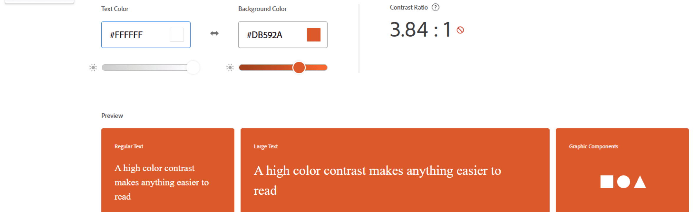
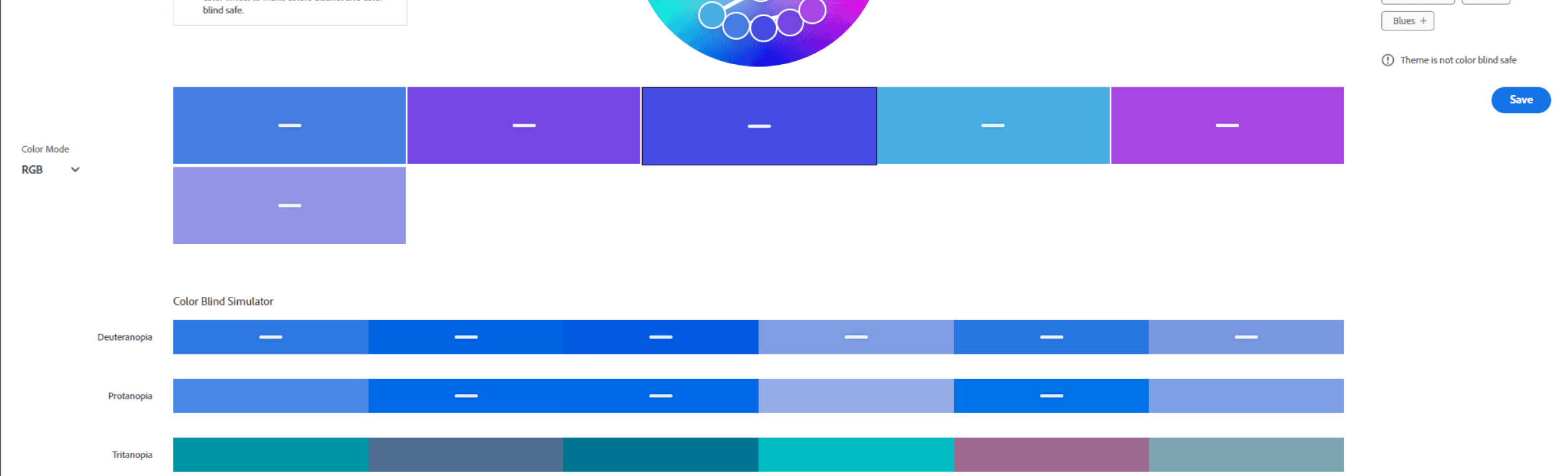
Adobe Color, the most commonly used public-facing tool based on interviews with 3 designers, has separate tools for contrast checking and color-blind safe palettes (shown to the right), but switching between them results in different pages with little data retention. Other tools focus on either simulating color blindness or meeting Web Content Accessibility Guidelines (WCAG), but not both. Additionally, most web accessibility tools assume a one-size-fits-all approach to color blindness, failing to account for varying severity levels, which limits their effectiveness.
Adobe Color, the most commonly used public-facing tool based on interviews with 3 designers, has separate tools for contrast checking and color-blind safe palettes (shown to the right), but switching between them results in different pages with little data retention. Other tools focus on either simulating color blindness or meeting Web Content Accessibility Guidelines (WCAG), but not both. Additionally, most web accessibility tools assume a one-size-fits-all approach to color blindness, failing to account for varying severity levels, which limits their effectiveness.
Key Question
Key Question
How can I integrate customizable color blindness simulations and web accessibility checks into a single platform while ensuring intuitive interactions?
How can I integrate customizable color blindness simulations and web accessibility checks into a single platform while ensuring intuitive interactions?
Key Challenges
Key Challenges
As a first-time React user, the biggest challenge was managing dynamic content updates.
As a first-time React user, the biggest challenge was managing dynamic content updates.
To implement features like automatic text field resizing and real-time updates based on the severity slider, I explored many resources on utilizing React hooks. I also leveraged my existing knowledge of HTML and CSS to connect the React code with the front-end structure.
Another challenge was balancing usability with accessibility standards for the tool itself.
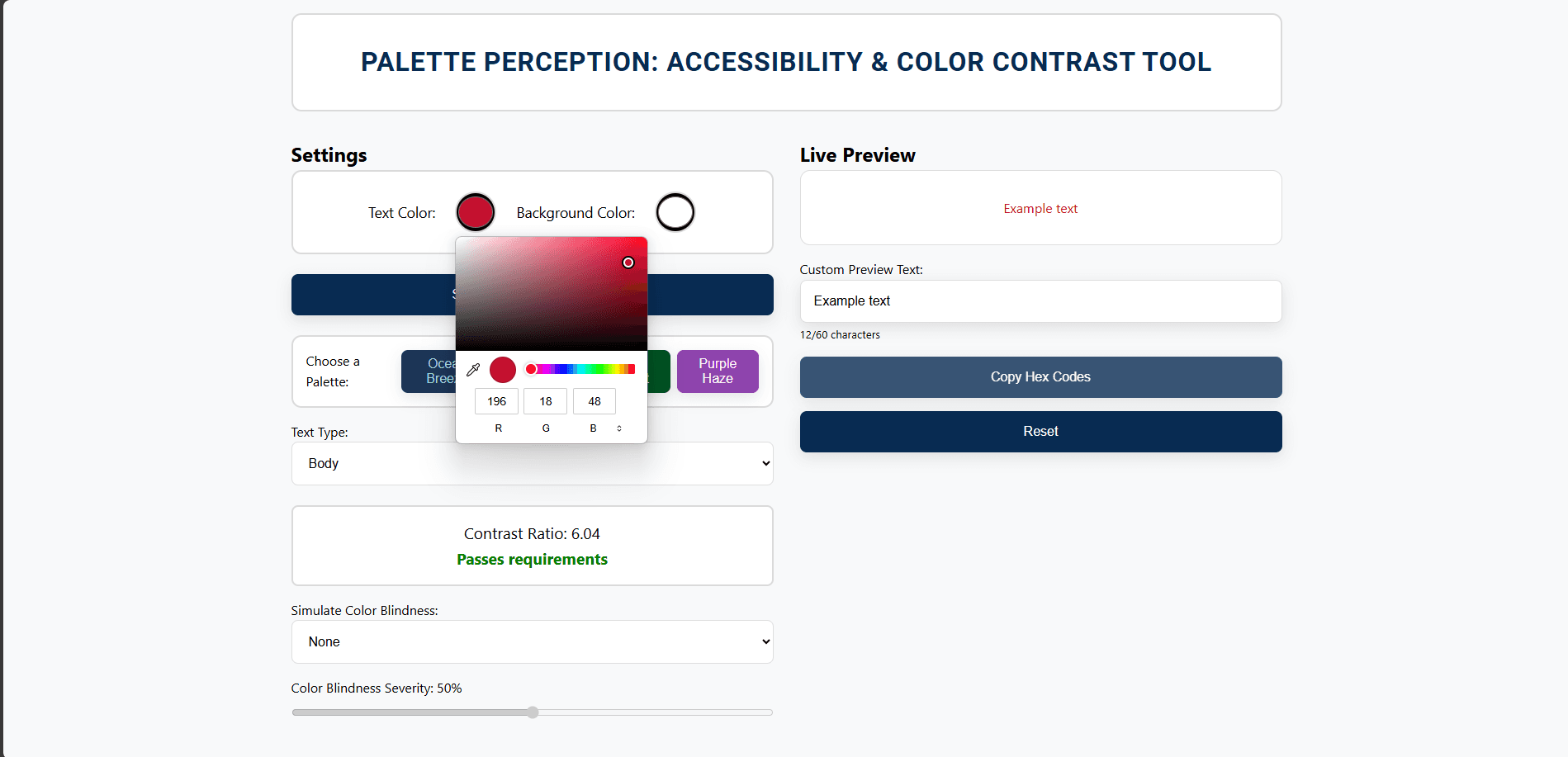
To address this, I organized the page with settings on the left for clarity and added affordances like shadows and reduced opacity on interactive elements. I also kept the tool’s color palette simple (using only dark blue, black, and white) to ensure it met WCAG standards.
Key Challenges
As a first-time React user, the biggest challenge was managing dynamic content updates.
To implement features like automatic text field resizing and real-time updates based on the severity slider, I explored many resources on utilizing React hooks. I also leveraged my existing knowledge of HTML and CSS to connect the React code with the front-end structure.
Another challenge was balancing usability with accessibility standards for the tool itself.
To address this, I organized the page with settings on the left for clarity and added affordances like shadows and reduced opacity on interactive elements. I also kept the tool’s color palette simple (using only dark blue, black, and white) to ensure it met WCAG standards.
My Learnings
1.
Implementing accessibility specifications
Implementing accessibility specifications
I dove deep into accessibility standards in late October and early November, studying WCAG and inclusivity resources from major tech companies like Microsoft and Apple. Since I recently gained this knowledge, I hadn't yet had the chance to apply it. Through this project, I was able to integrate these guidelines, enhancing the tool's inclusivity, user-friendliness, and overall impact.
2.
2.
Coding with React
Coding with React
This was my first time using React. While I had a basic understanding of HTML and CSS, this project pushed me to expand that knowledge while learning intricate features of React. I spent a significant amount of time reviewing documentation and finding relevant examples to implement the features I envisioned.
Next Steps
Further testing
After developing Palette Perception, I conducted informal testing with four people. Based on their feedback, I plan to improve visibility of information about the colors and provide clearer documentation around the tool’s usage. Once these changes are implemented, I will conduct more formal usability testing with the target audience of designers.
2.
Making Palette Perception publicly available
I will start by ensuring the tool is compatible across different devices and browsers. Then, I plan to share the tool on relevant design and accessibility forums to collect further feedback. Simultaneously, I’ll promote it within my network and online communities. Throughout the process, I will keep refining the tool based on user input and evolving accessibility standards.
My Learnings
Implementing accessibility specifications
I dove deep into accessibility standards in late October and early November, studying WCAG and inclusivity resources from major tech companies like Microsoft and Apple. Since I recently gained this knowledge, I hadn't yet had the chance to apply it. Through this project, I was able to integrate these guidelines, enhancing the tool's inclusivity, user-friendliness, and overall impact.
2.
Coding with React
This was my first time using React. While I had a basic understanding of HTML and CSS, this project pushed me to expand that knowledge while learning intricate features of React. I spent a significant amount of time reviewing documentation and finding relevant examples to implement the features I envisioned.
Next Steps
1.
Further testing
After developing Palette Perception, I conducted informal testing with four people. Based on their feedback, I plan to improve visibility of information about the colors and provide clearer documentation around the tool’s usage. Once these changes are implemented, I will conduct more formal usability testing with the target audience of designers.
2.
Making Palette Perception publicly available
I will start by ensuring the tool is compatible across different devices and browsers. Then, I plan to share the tool on relevant design and accessibility forums to collect further feedback. Simultaneously, I’ll promote it within my network and online communities. Throughout the process, I will keep refining the tool based on user input and evolving accessibility standards.