Anika Jain
Projects
About
Contact
Fidgy
Topics:
Accessibility
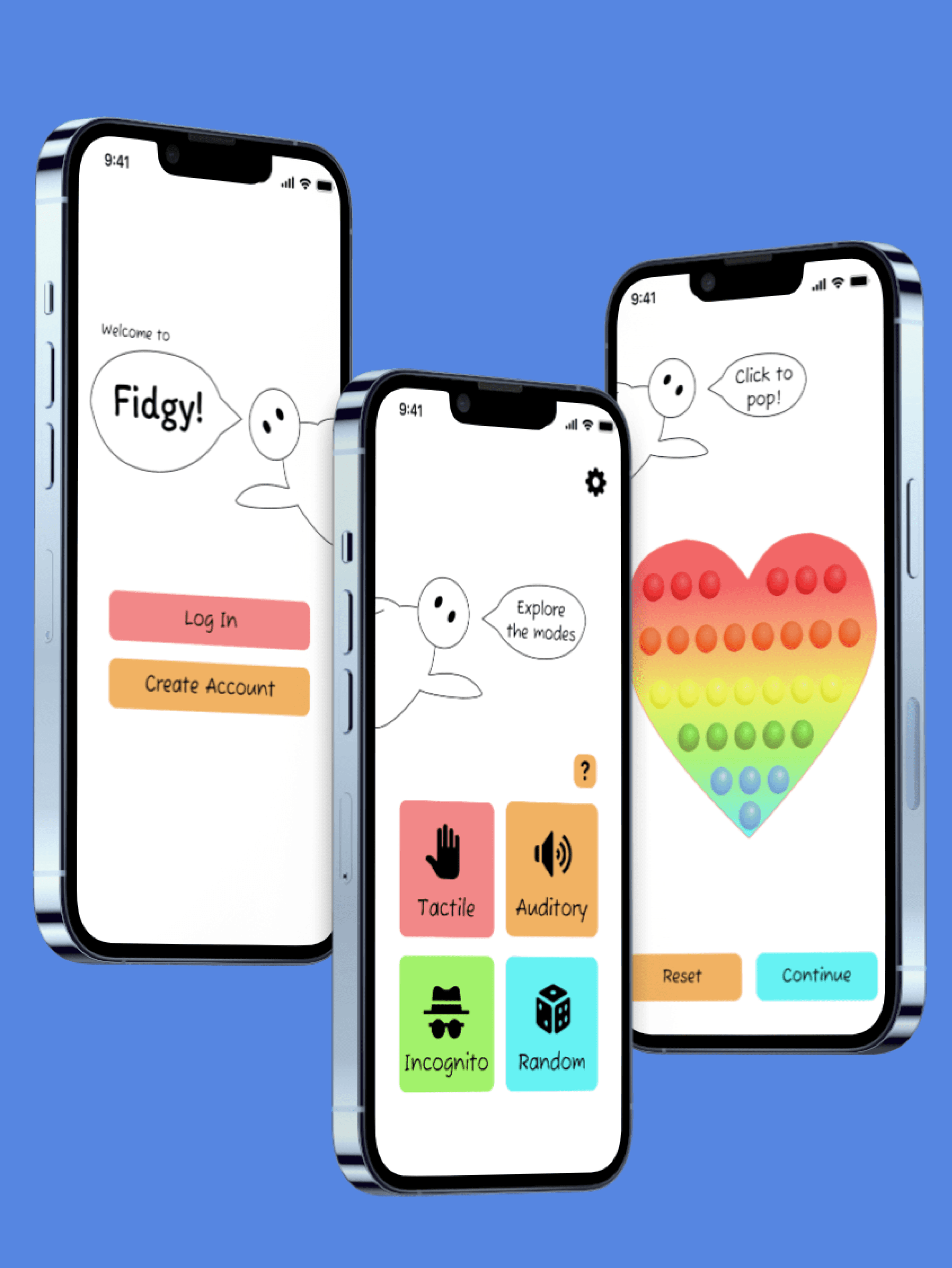
Fidgy is an iPhone application designed for neurodivergent people to fidget freely without fear of judgement. Users can pick a mode that satisfies their sensory needs, such as auditory or incognito, and can then select from a variety of fidget types. Fidgy was created as a solo project for a UI/UX Design class at UIUC.
Roles:
Sole researcher, designer
Duration:
Jan 2024 - Jun 2024
Tools:
Figma
The Problem
There is no app that allows both variety of fidget tools and options that alleviate fear of judgement in public settings.
Empathize + Define
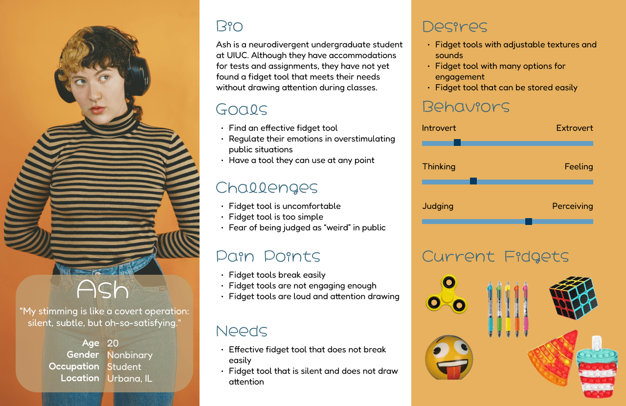
I initially lacked understanding in the factors that influenced people’s use of certain fidgets. I sought to answer the following questions:
What are the most commonly used solutions?
What are the primary frustrations with physical fidgets?
How do environmental factors influence the use of different fidgets?
To address these, I gathered insights via a survey with 7 respondents and 4 follow-up interviews.
Participants expressed concerns about their fidgets being perceived as "weird" by others, which influenced their preference for quiet fidgets that could be used in public without drawing attention. They also valued durability, with many voicing concerns about physical fidgets breaking easily. One participant shared that physical fidgets lose their stimulation value over time, causing boredom.
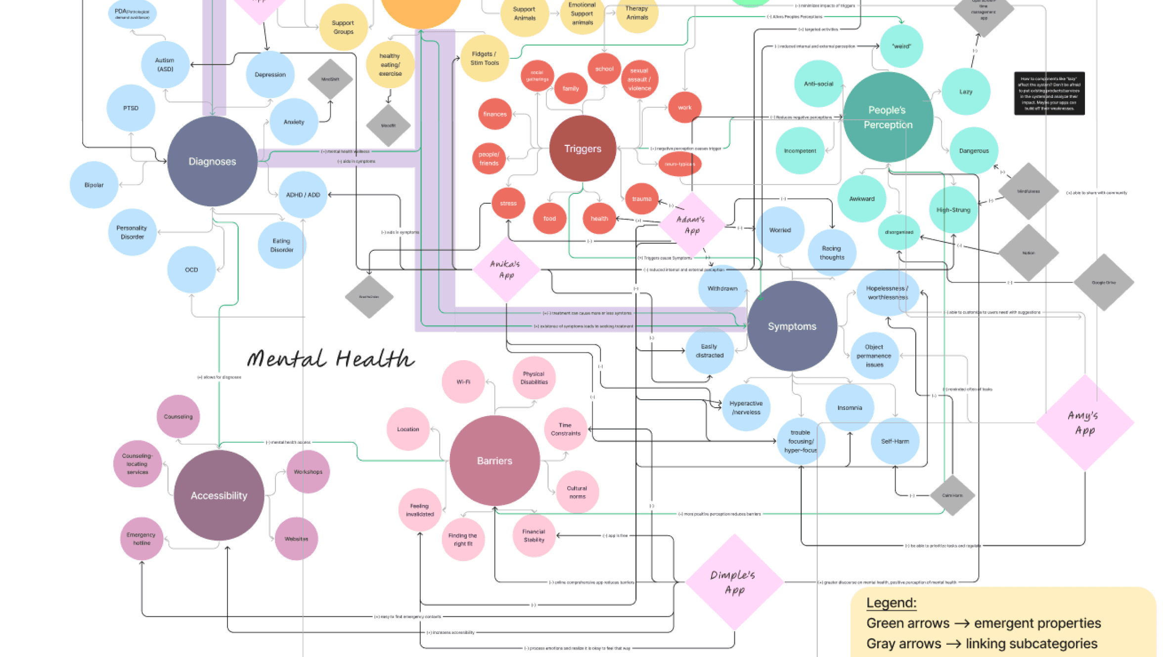
To the right is a system map on mental health I created with others in the class, which helped me define Fidgy's benefits in the broader context.
Ideate
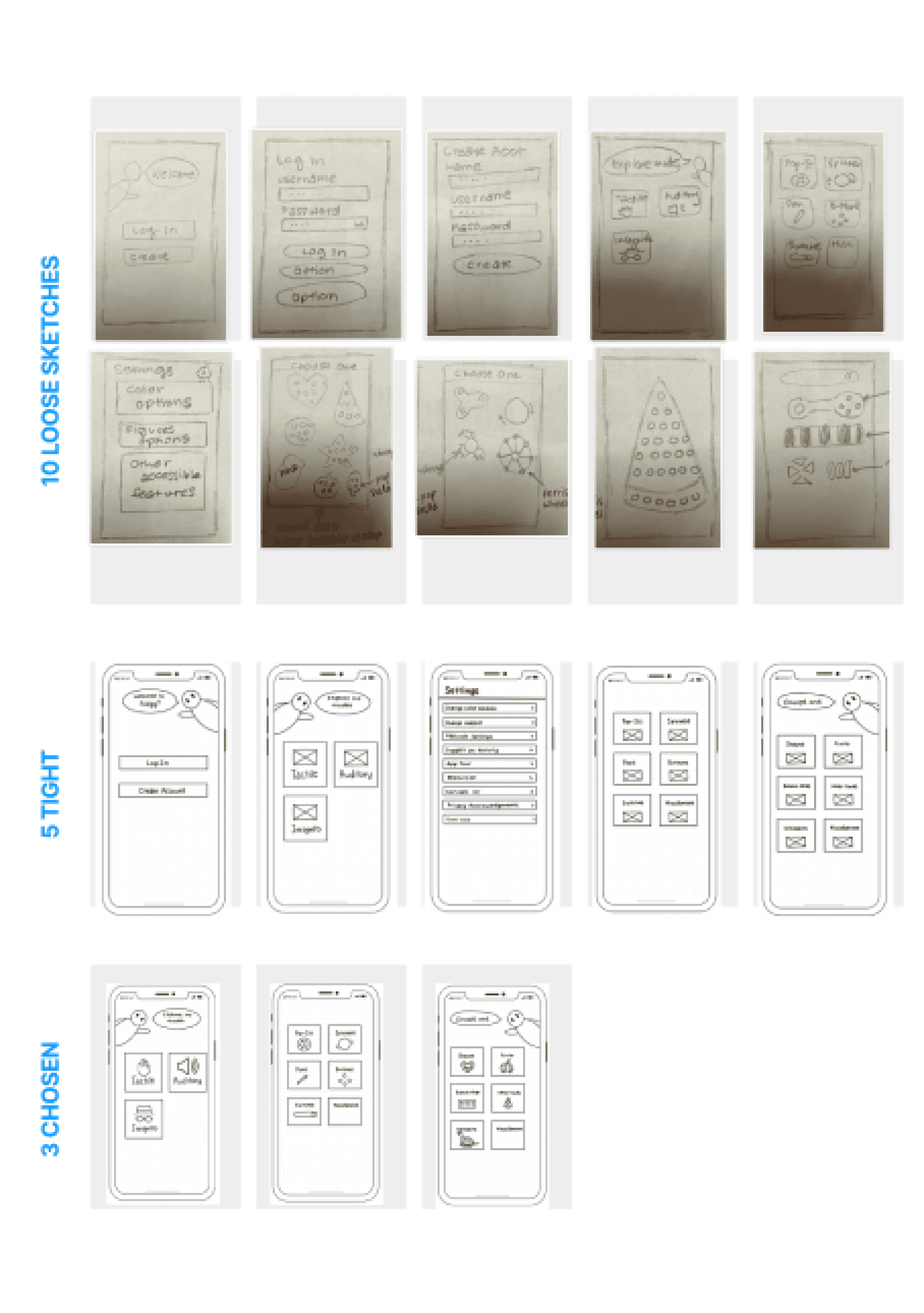
After gathering insights about my target audience through initial research, I began conceptualizing a mobile application to address their pain points. Guided by our professor's advice, I started sketching on paper, focusing on freely exploring ideas without worrying about sizing or alignment constraints.
My goal was to balance the presentation of options to avoid overwhelming users. To support this, I introduced Fidgy, a character designed to guide users throughout the app.
Prototype — Low-Fidelity
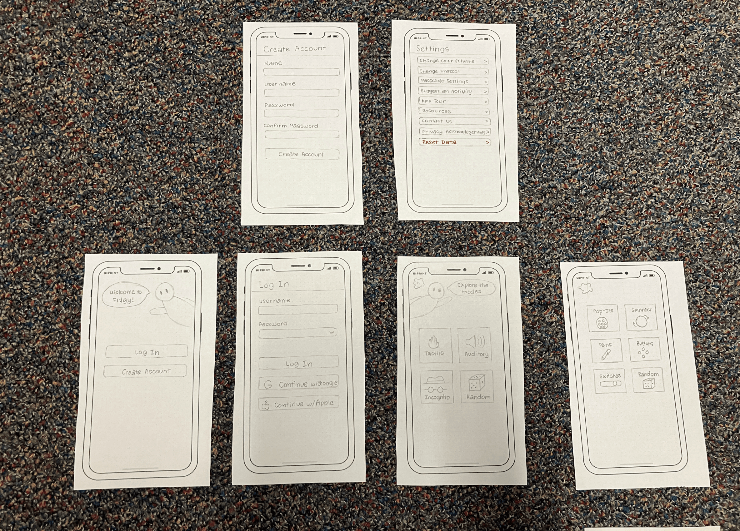
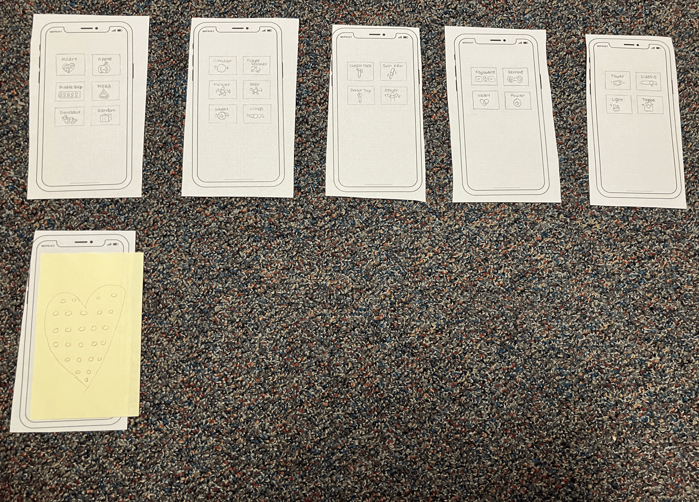
After the ideation process, I created low-fidelity screens and performed usability testing with 3 people. While testing, I made quick adjustments such as adding a settings icon, which I initially overlooked. I also added a popup on the Modes page when random was selected stating which option was automatically picked.
Testing validated the Fidgy mascot and the associated dialogues.
Testing revealed confusion around the meaning of “incognito”.
In addition to the “incognito” clarification, multiple participants expressed desire for a reset button for the activities. The process of testing highlighted some critical errors, such as missing back buttons on the screens. Users also performed unexpected actions, such as trying to click the Fidgy mascot with the expectation of an animated interaction.
Prototype — Mid-Fidelity
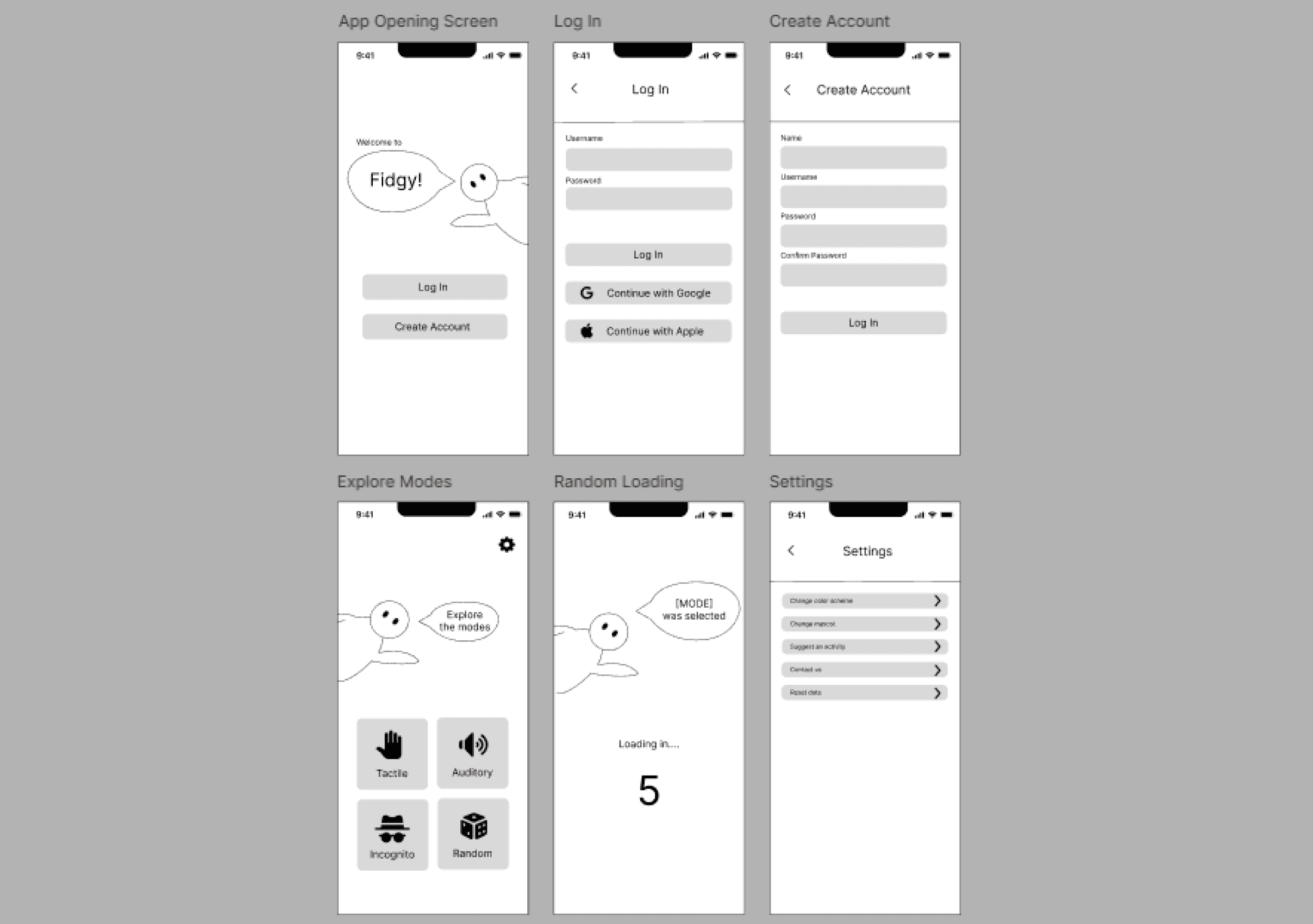
Next, I used Figma to create mid-fidelity screens, diving deeper into screen details and interactions. As a Figma newcomer, I supplemented the course learning with tutorials, external resources, and regular guidance from my professor.
I then conducted usability testing with 3 participants, uncovering a consistent concern: the animated countdown during mode selection caused anxiety due to the inability to revisit or change selections.
Following discussions with classmates and my professor, I also realized the need for improvements in alignment and layout.
The course's exercises provided me with initial exposure to Figma, and I applied my new skills by building Fidgy in the platform.
Implement — High-Fidelity (at a glance)
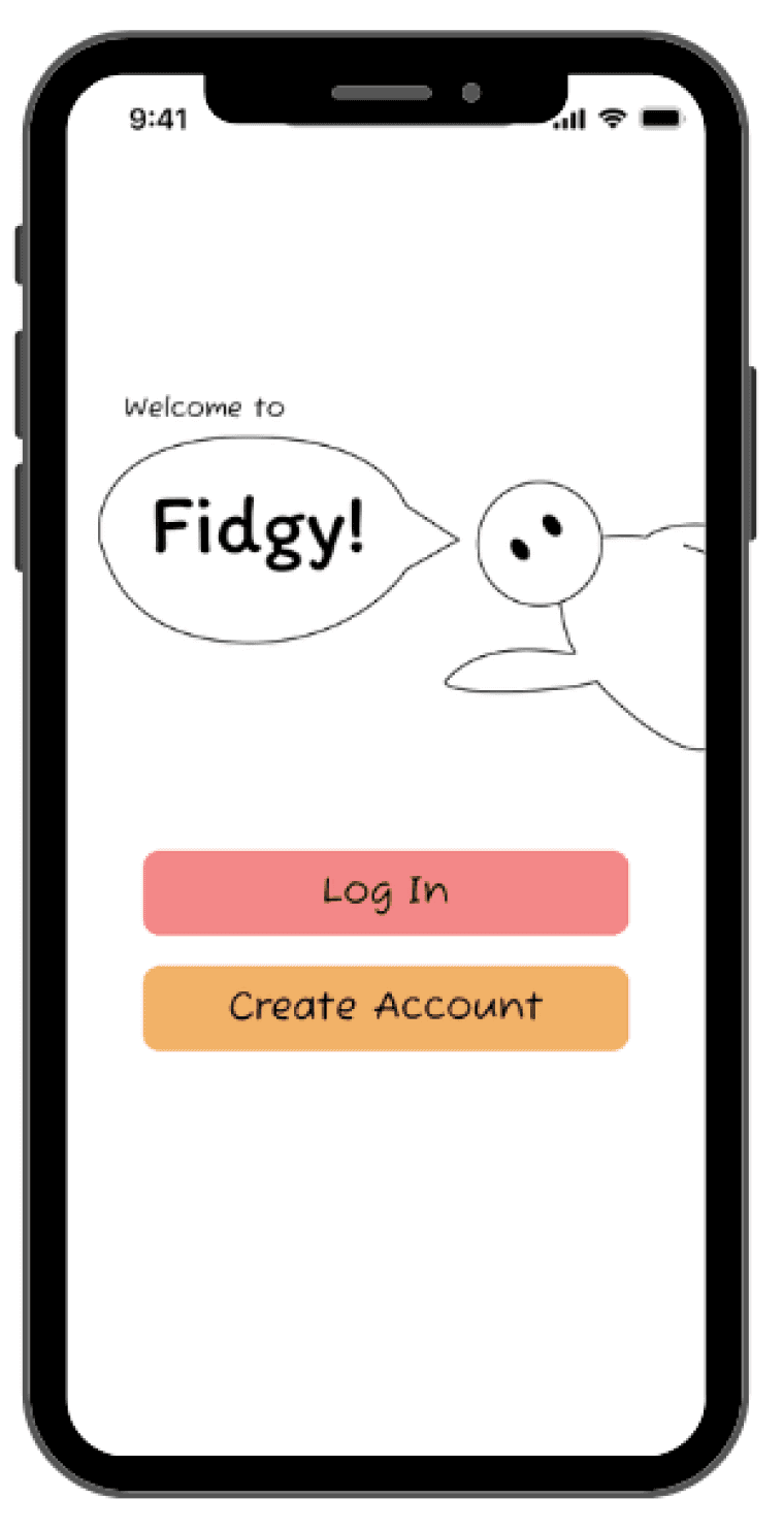
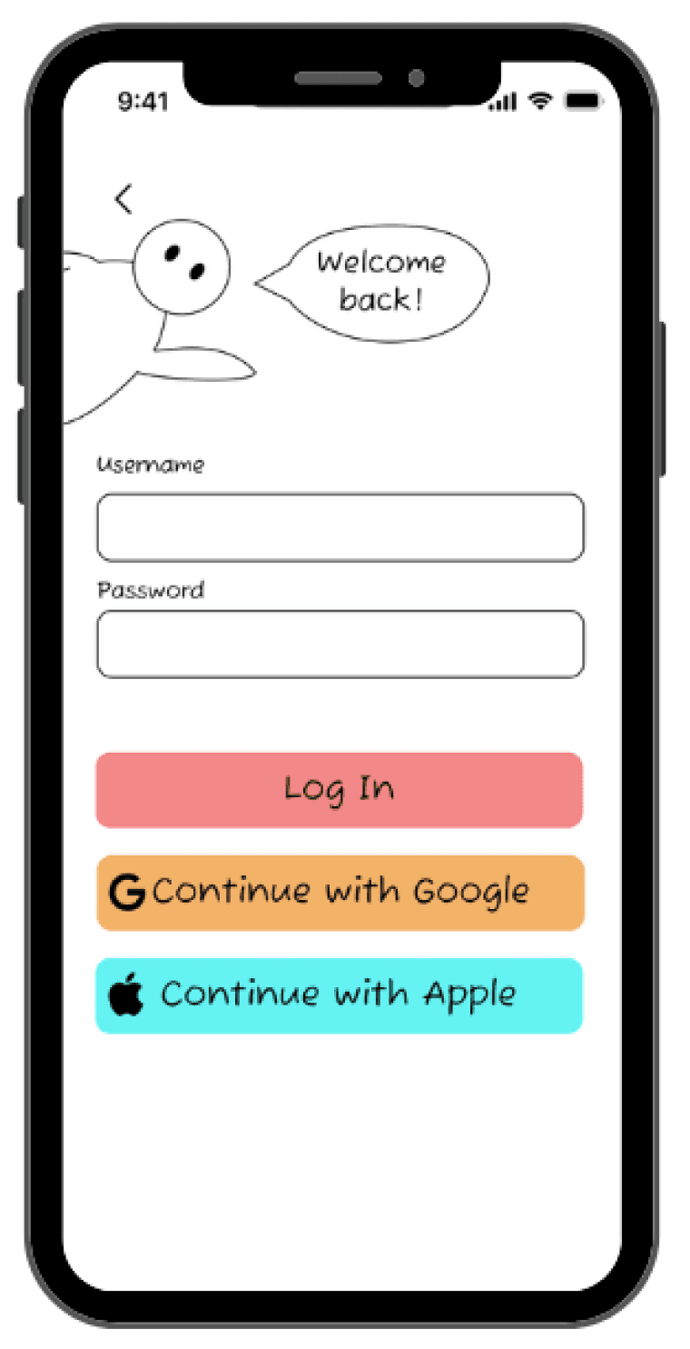
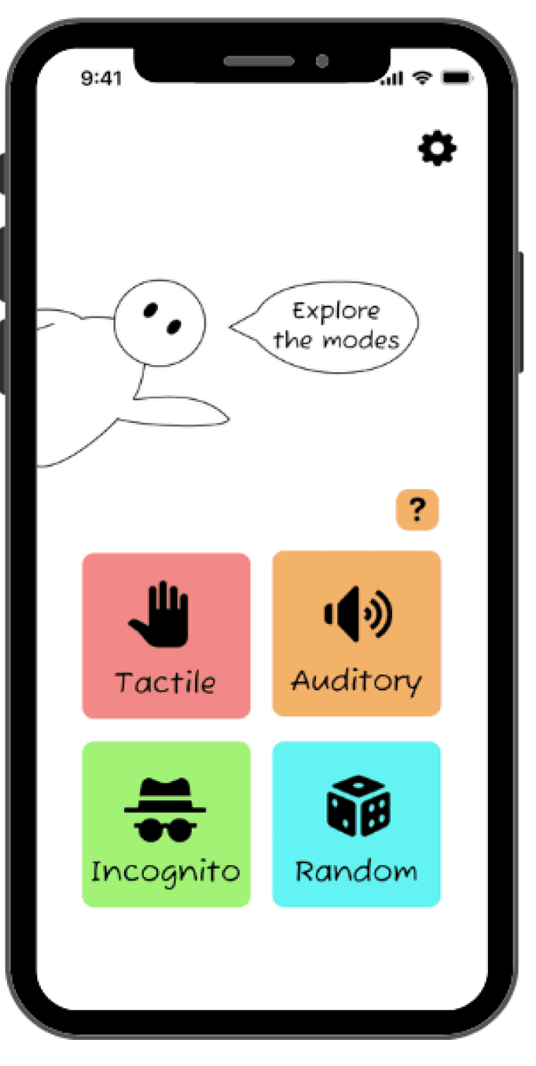
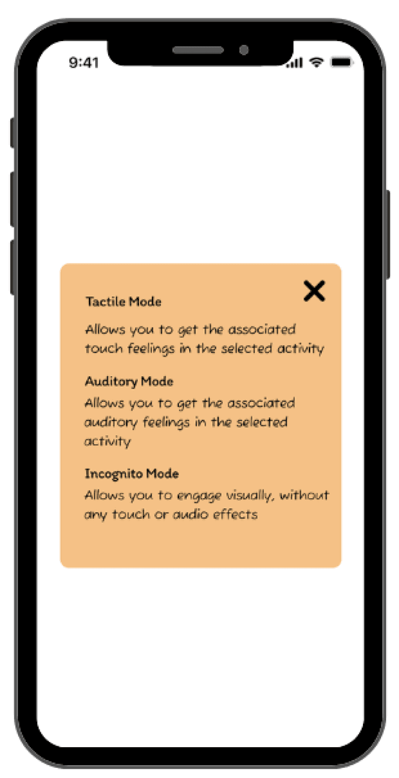
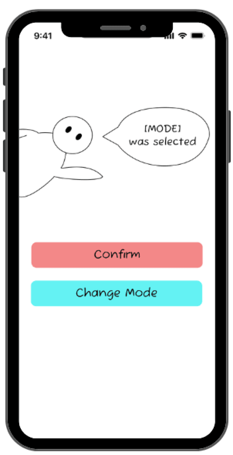
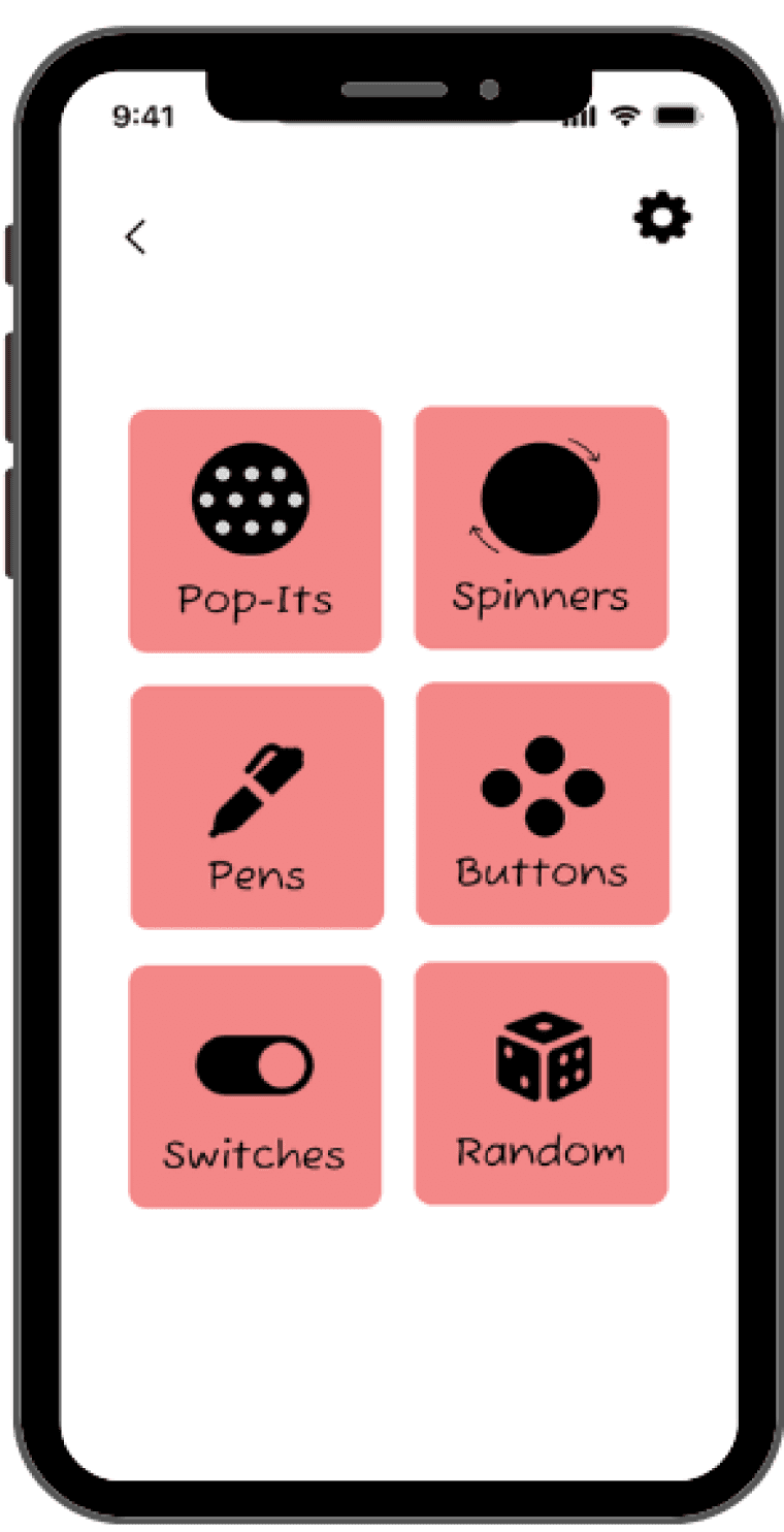
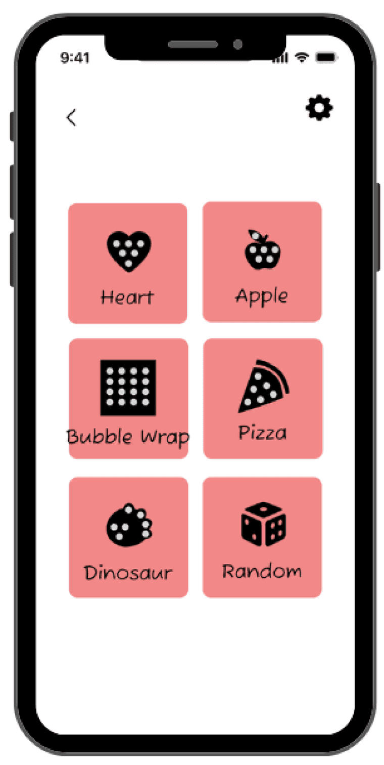
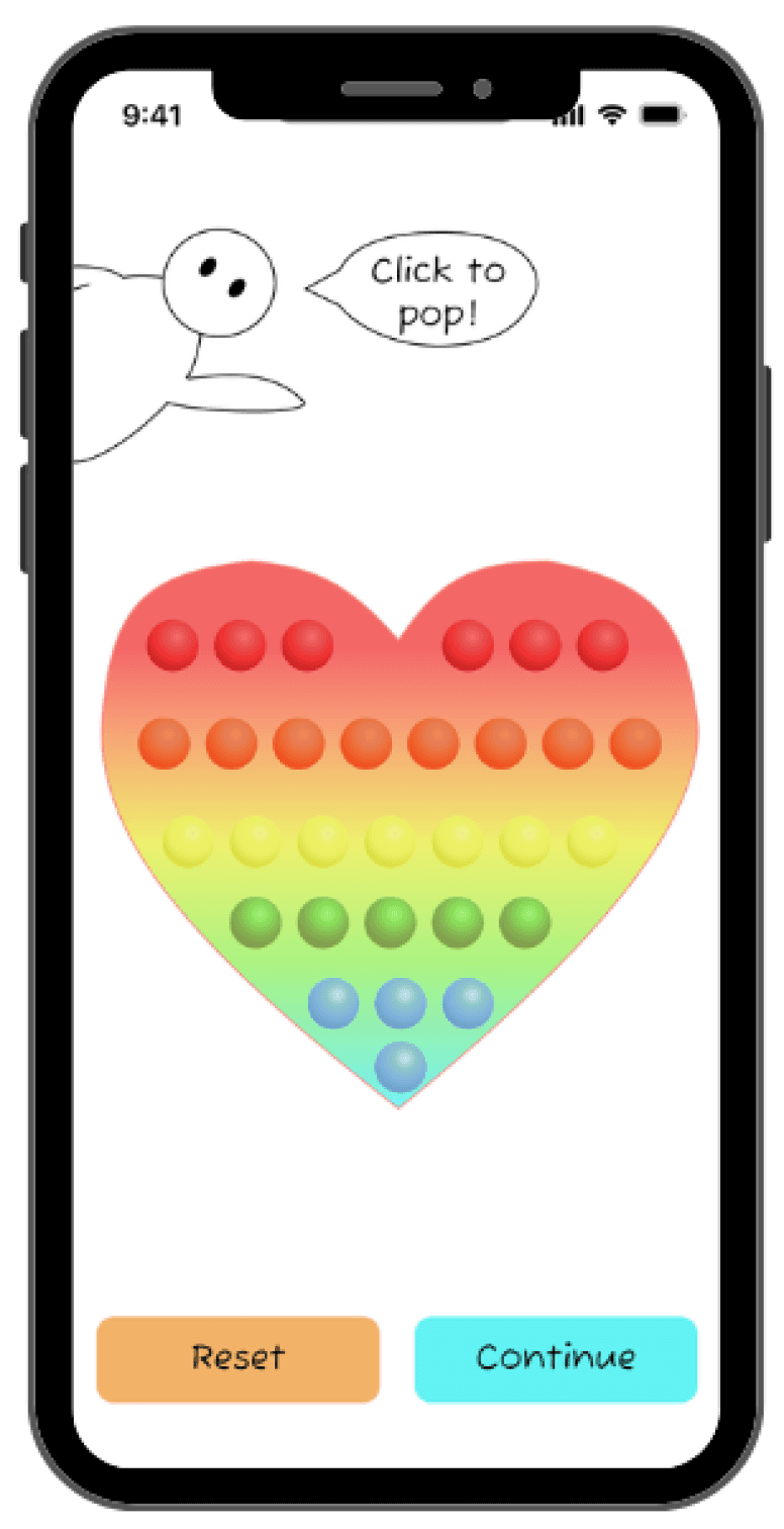
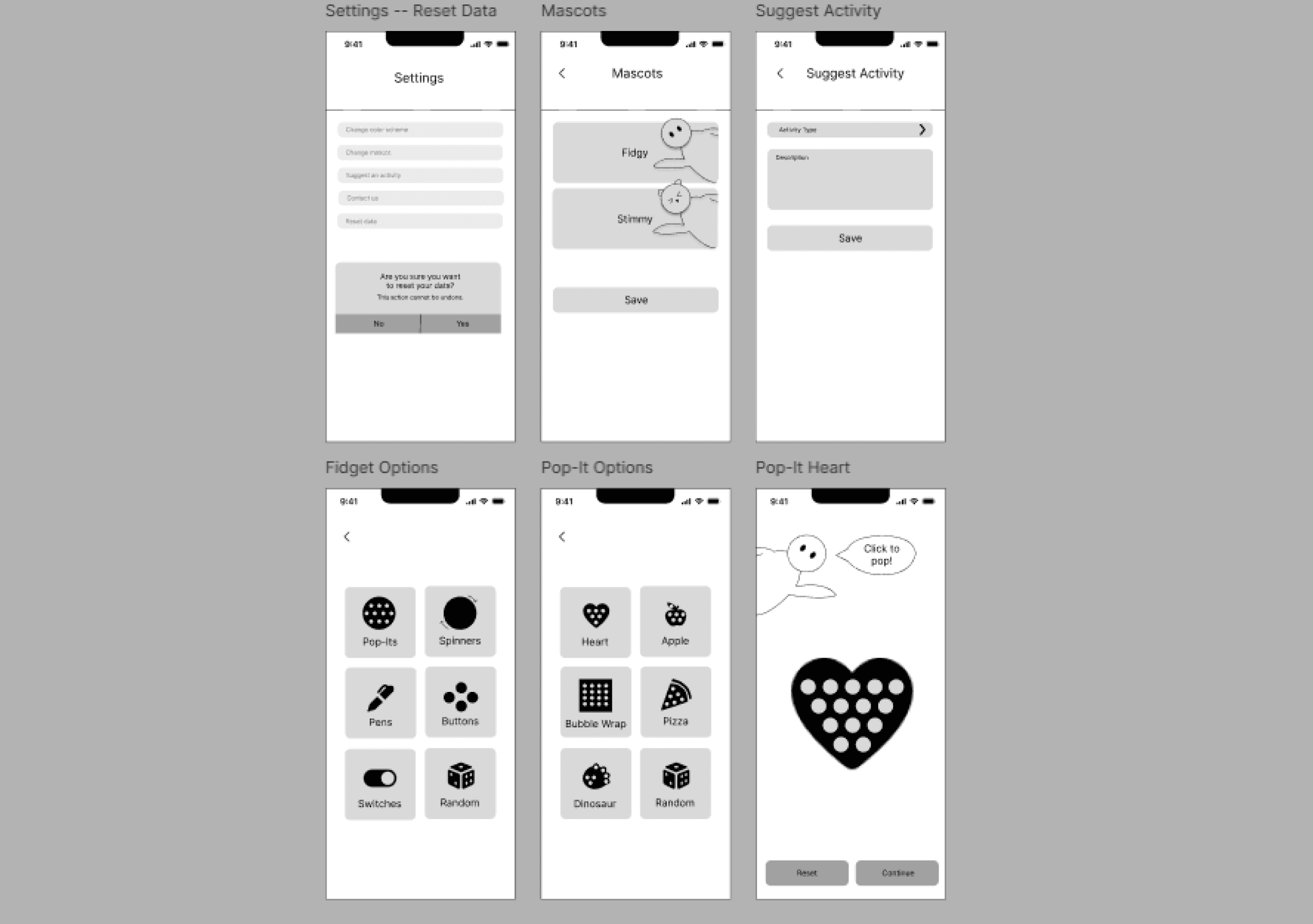
Implement — High-Fidelity
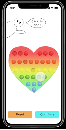
The biggest challenge was figuring out how to implement the various features.
To simulate the pop-it and spinner functions, I had to dive deep into Figma's component variants and prototype interactions. This involved watching tutorials, multiple consults with my professor, and studying Figma community files that had similar features. Through this process, I also discovered Figma's effects options, which helped me add realistic touches to the fidgets, especially the pop-its.
Another challenge was balancing personalization options without overwhelming the user.
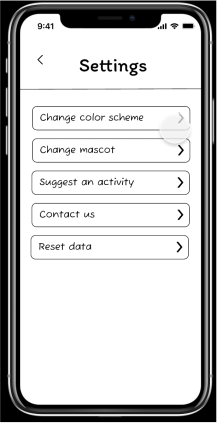
To simplify the user experience, I intentionally capped the number of on-screen options at six. Through testing, I determined this to be an optimal amount. Additionally, I separated personalization options into a dedicated settings section. For the color scheme options, I used a single gradient button, avoiding clutter and streamlining the interface. I also limited mascot options to Fidgy and Stimmy, maintaining a stable core experience while still offering users a degree of customization.
My Learnings
Applying the UI/UX design process
I entered this course with a foundational understanding of UI design from a computer science perspective. This course offered a fresh and distinct approach to the design process, emphasizing the iterative refinement needed to transform ideas into polished products.
2.
Creating with Figma
This course marked my introduction to Figma. Through the creation of Fidgy, I discovered the power of components with variants in creating diverse options. I also was able to leverage layout features, such as grids and auto-layout, to establish a balanced and structured content design.
Next Steps
Feedback implementation
Rapid testing of the high-fidelity prototype with 12 classmates yielded valuable insights. Participants responded positively to the app's features, particularly the customizable avatars. Additionally, participants were impressed by the extensive options and color schemes implemented in the prototype. Key areas to improve include increasing button sizes and addressing functional issues with some of the buttons.
2.
Developing Fidgy
After enacting on the feedback, I intend to develop and release Fidgy on the App Store, expanding my mobile development skills from Android to iOS by learning Swift and navigating the App Store publishing process.