EZ Bike
Topics:
Miscellaneous
EZ Bike is a concept for Ford’s next-generation electric bikes, designed to make riding safer and easier with semi-autonomous technology. As part of a team of four in CMU’s Interaction Design class, I led research on user needs and safety as well as led the creation of the bike’s digital dashboard and associated mobile app. I also contributed to the design of the bike handles, which seamlessly bridge physical functionality of the bike with the digital interfaces.
Roles:
Design lead, UX researcher
Duration:
Oct 2024 - Dec 2024
Tools:
Figma
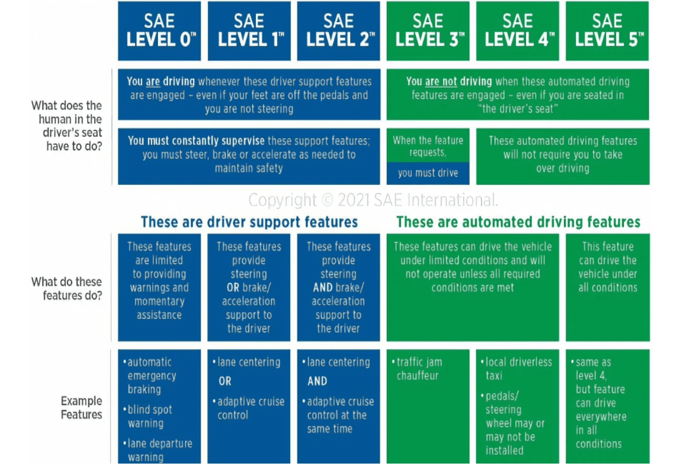
Currently, no legally operable vehicle allows drivers to engage in other activities for the majority of the driving time.
Our team was not familiar with levels of autonomous driving prior to this project, and had limited experience with existing vehicles that employ autonomous features.
After doing research around the different levels, we targeted Level 3, which means the following:
Limited Responsibility: The vehicle can handle most driving tasks, with exceptions in certain conditions
Reduced Supervision: The driver doesn’t need to constantly monitor the vehicle, but must still be ready to intervene if the system requests it
Key Question
How might we leverage new autonomous technologies to create intuitive interaction designs for electric bikes?
Initial Research
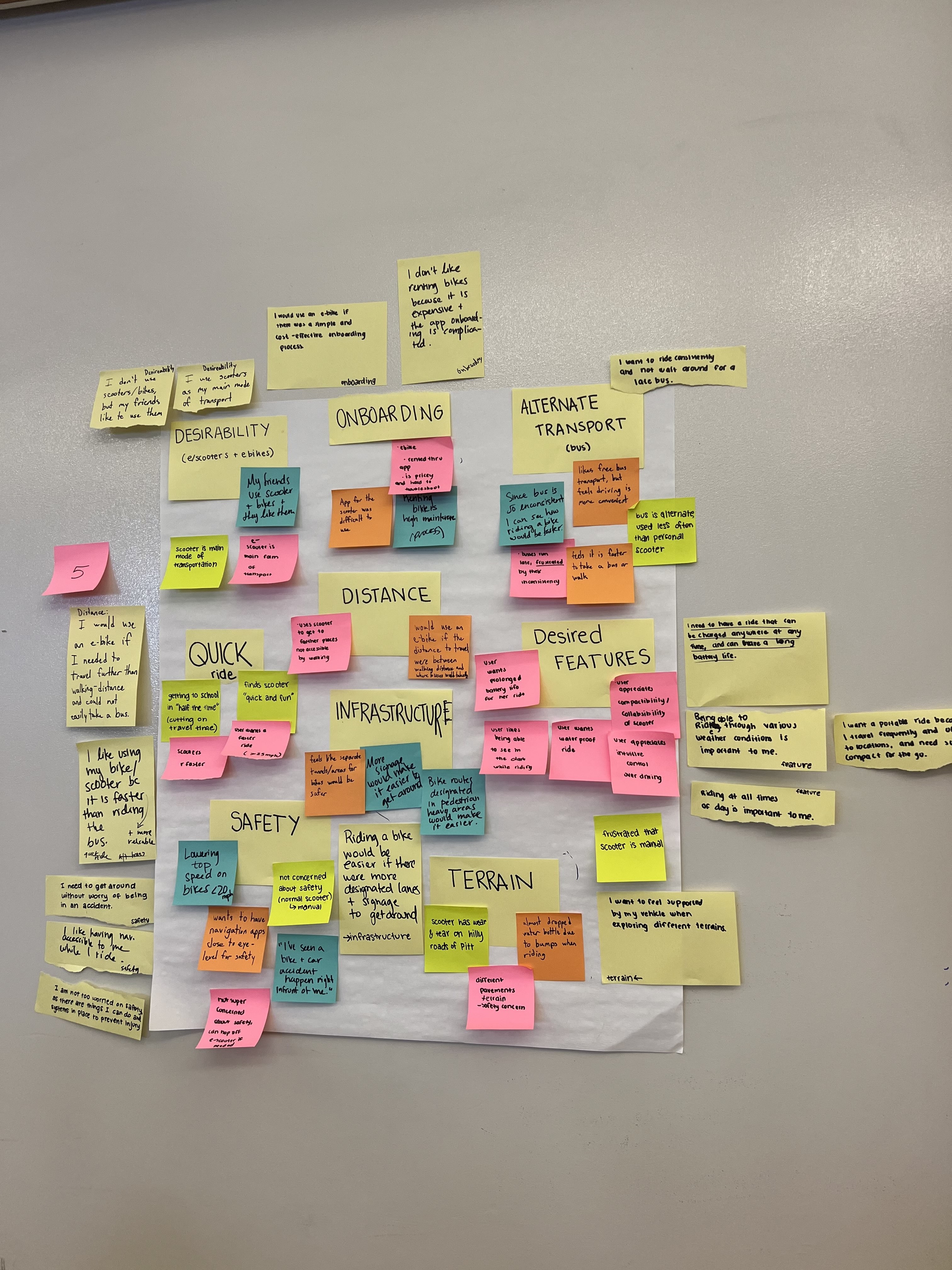
We started by identifying existing gaps in current transportation modes used by students on the CMU campus. Through short interviews with strangers on scooters and bikes, we uncovered the following:
Onboarding: Unclear instructions and complicated rental systems discouraged new users from utilizing the vehicle
Safety Measures: Safety and infrastructure were major concerns. Many participants cited feeling unsafe in traffic and expressed frustration with the lack of designated bike lanes
Distance: Participants were frustrated as they had to often charge their vehicles, resulting in limited distance that could be traveled at once
These interviews led to our decision to create an e-bike that a user owns (not rents) with safety as the main priority.
Task Analysis and Conceptualization
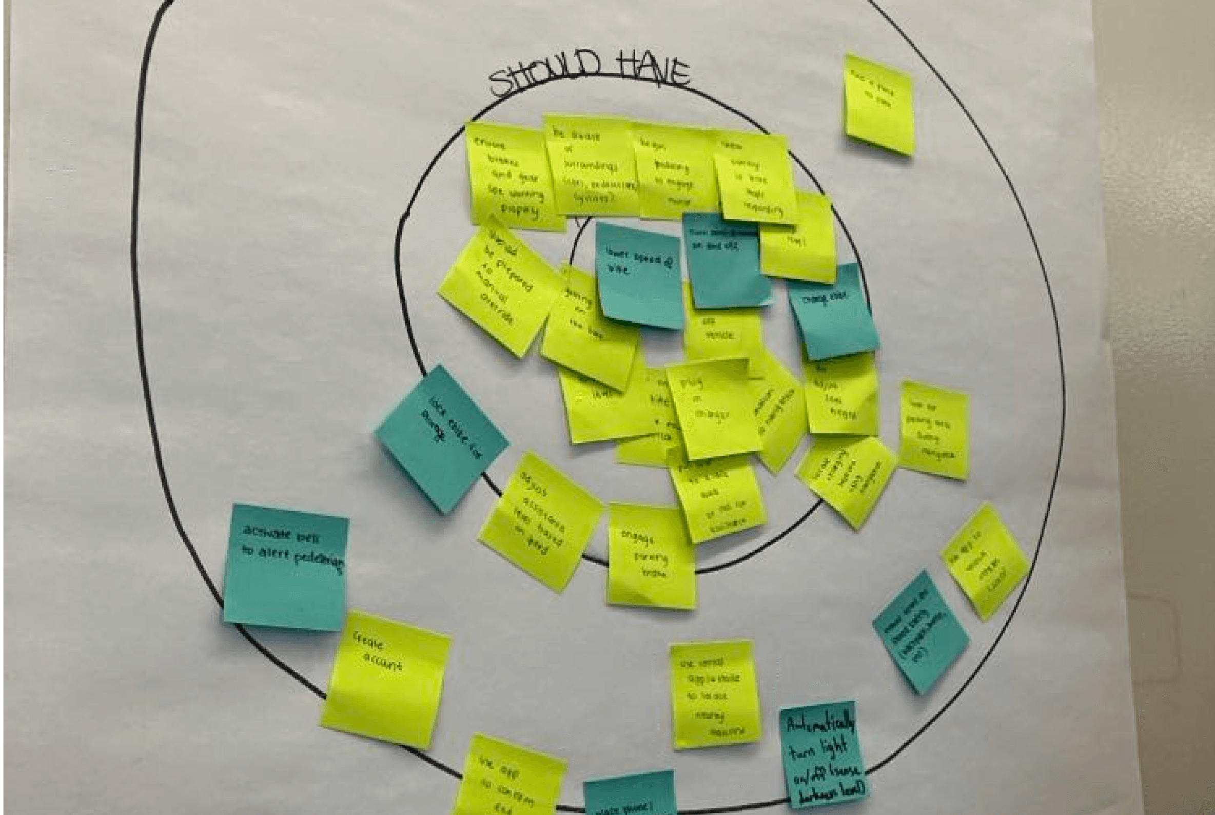
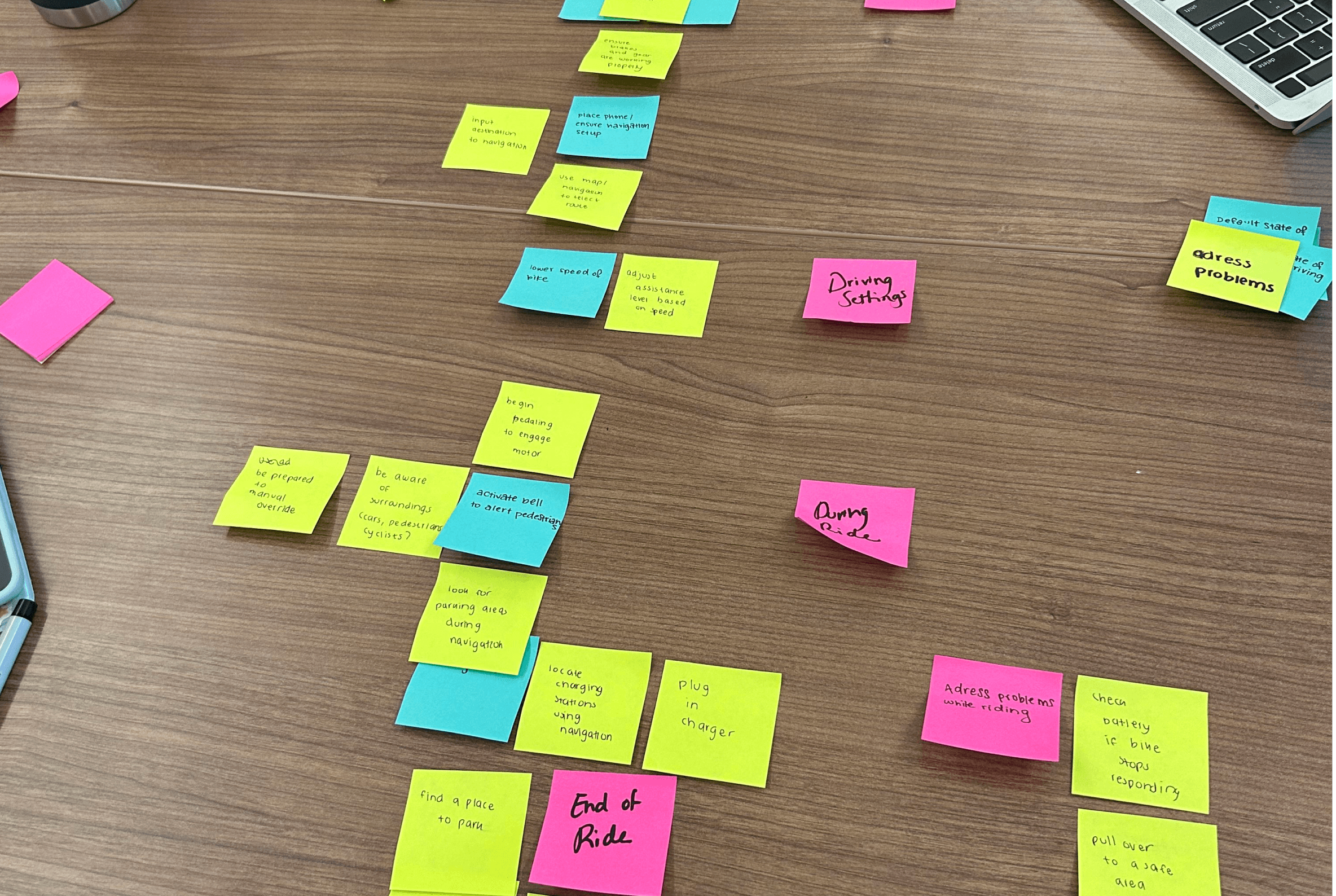
Following the interviews, we began brainstorming what features we wanted our bike to include. A key challenge was determining how many more controls the bike should have compared to a regular bike. In this process, we also outlined what the user’s ride would look like from start to finish.
Safety concerns inspired the key features of lane assist and blind spot detection for our e-bike.
Physical Prototyping
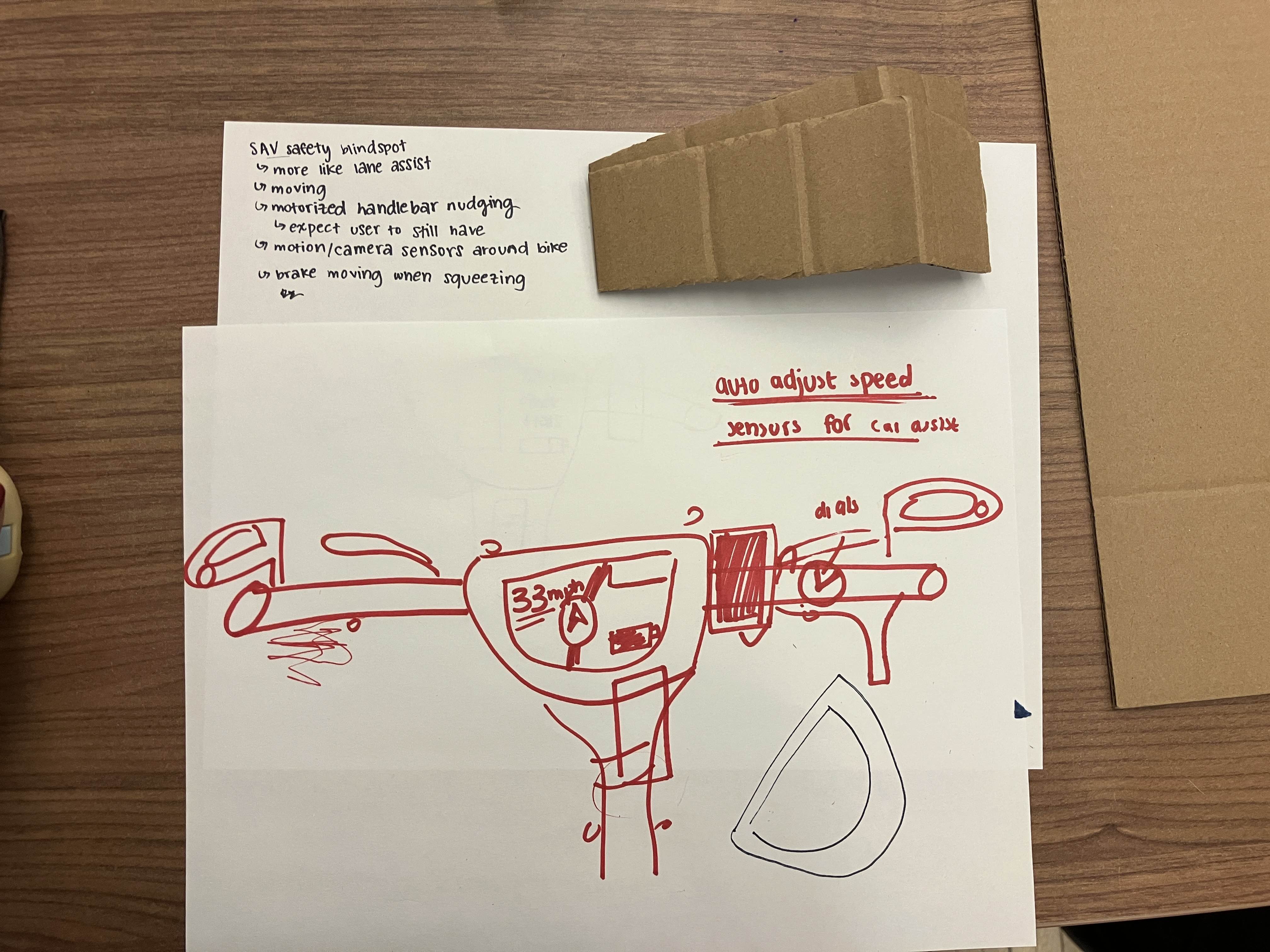
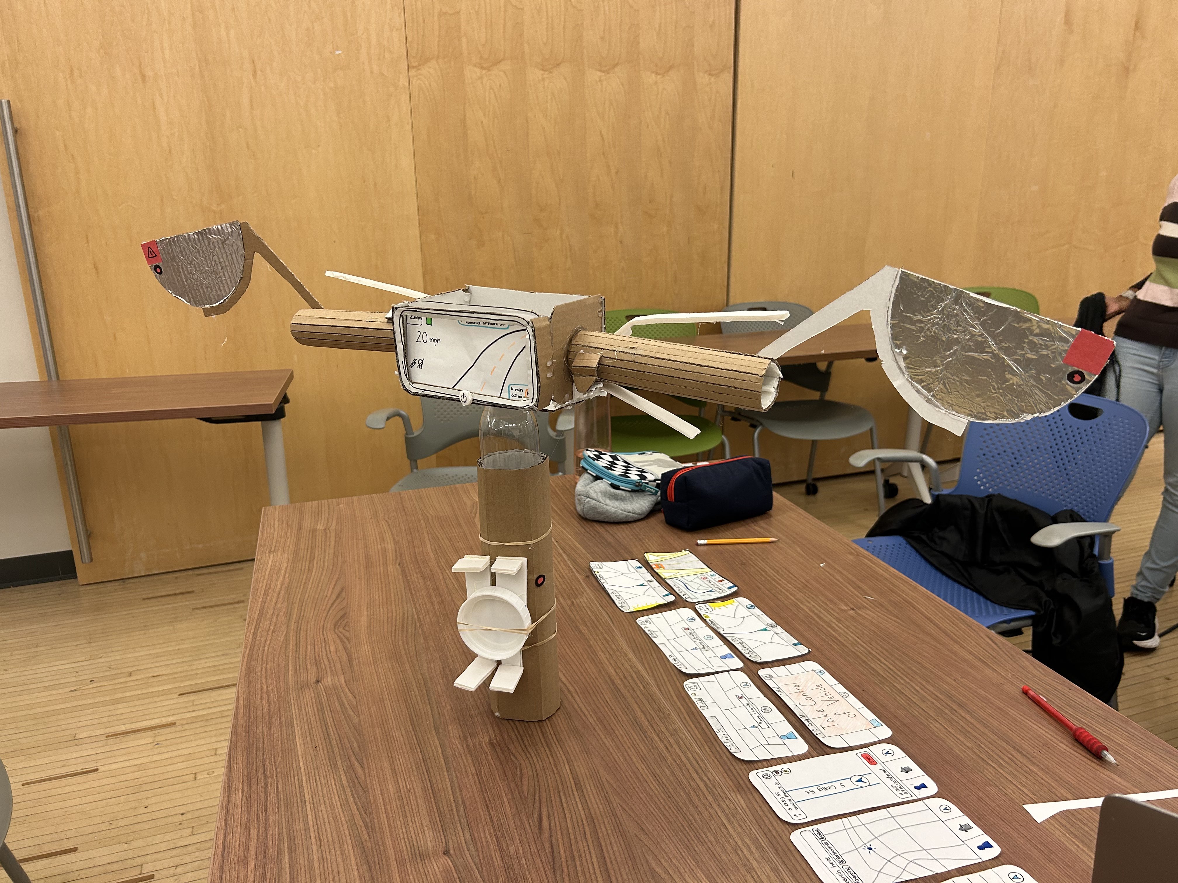
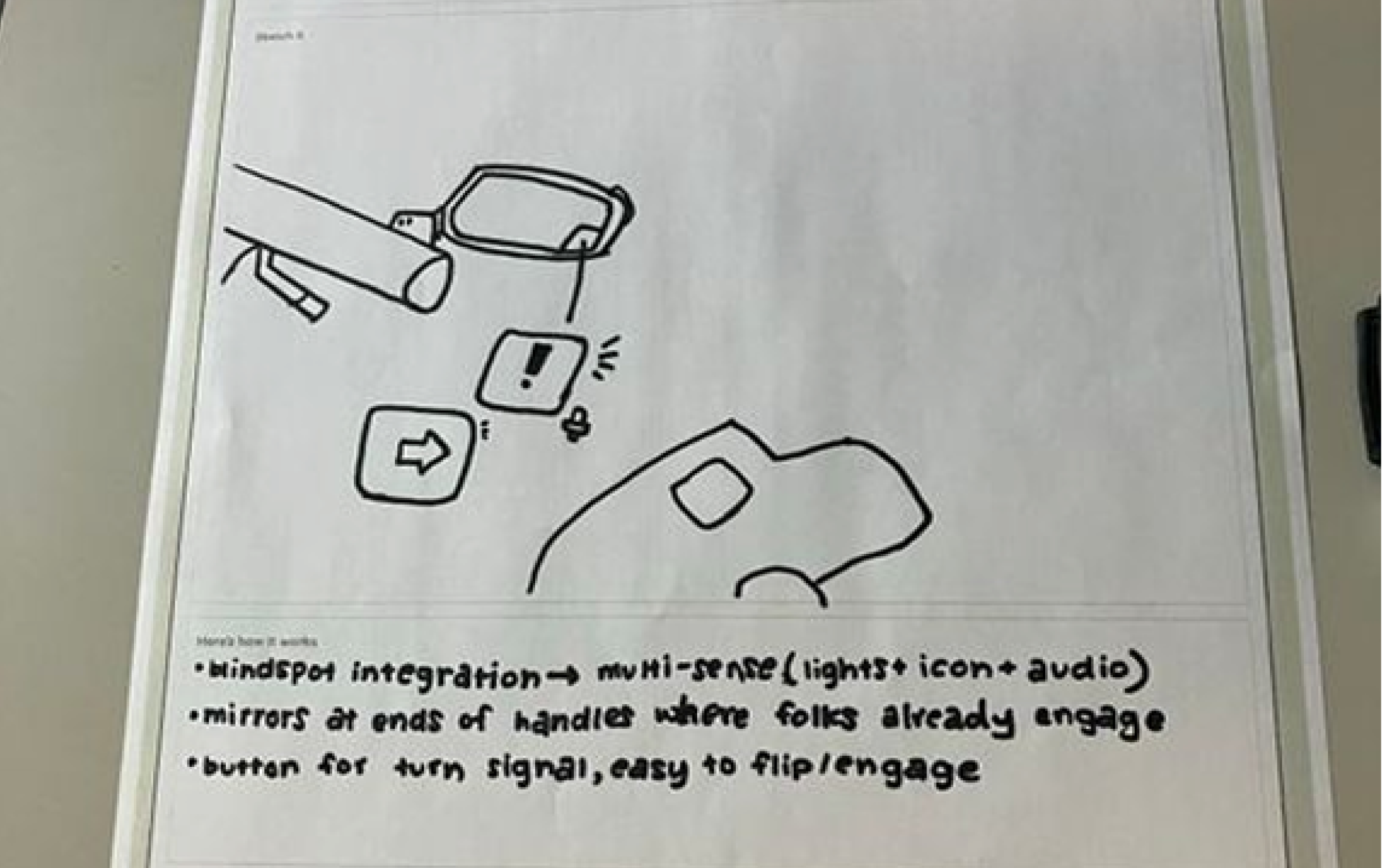
As we began prototyping, we drew inspiration from car features to introduce familiarity for users, incorporating elements like mirrors, turn indicators, and blind spot detection to enhance safety. Responding to feedback from our instructors, we double-encoded blind spot warnings in both the mirrors and the dashboard.
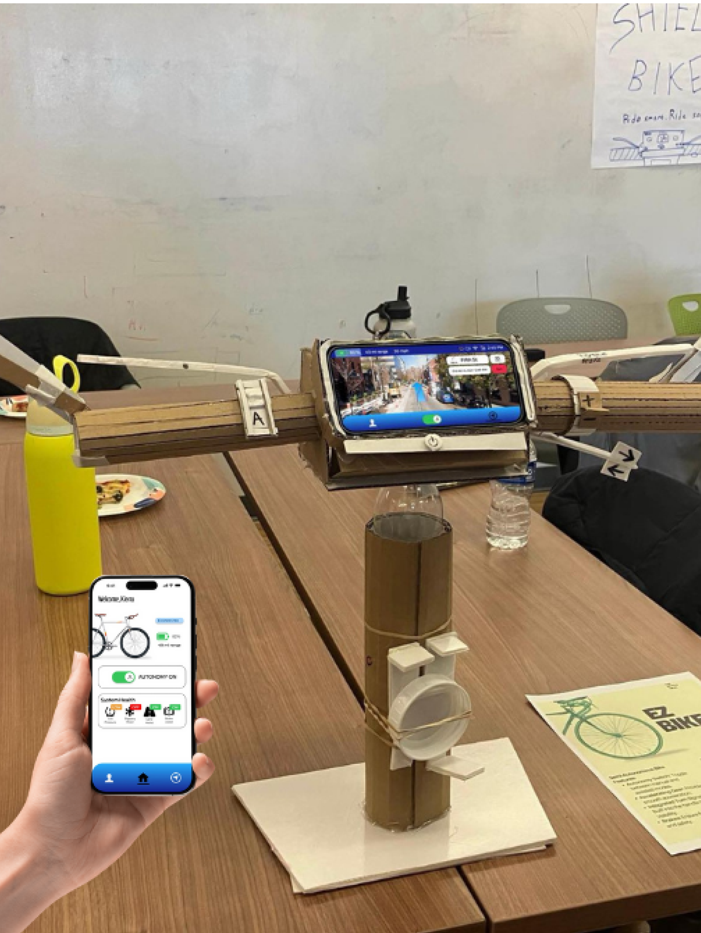
The physical prototype includes a central dashboard for GPS display, an easy-to-access power button, and flexible foam brake handles that provide a natural feel. To improve communication with other road users, we added a turn signal under the right handlebar. For convenience, we also included a phone holder below the dashboard screen to avoid their screen distracting them. We also incorporated headlights, ensuring safe travel in low light conditions.
My attention to detail and analytical mindset was crucial in refining the controls' design for safety and accessibility.
Paper Prototyping of the Digital Interfaces
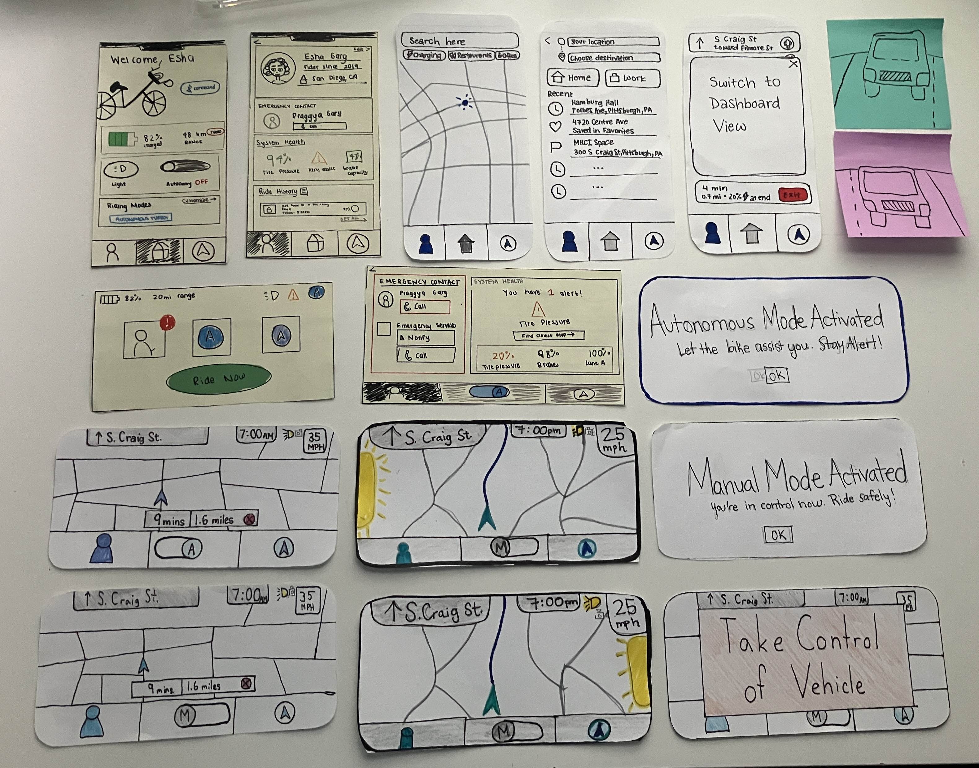
In order to ensure consistency in the app and dashboard, we incorporated a lower navigation bar. This also adheres to Fitts’ Law on the phone screen, making it quicker to switch between screens.
I made sure we used distinct orange coloring for the warning popups to pull attention back to the screen and have the user take the appropriate action. Here, we only have coloring for the “Take Control” popup but in later versions we extended this to the mode switching popups as well.
Following testing, we removed the camera view popups as we discovered that users found them distracting and confusing.
I led efforts to ensure consistency across interfaces, emphasizing colors and iconography to ensure clarity and grab attention when needed — elements that were initially overlooked by the rest of the team.
Wireframes of the Digital Interface
In the initial dashboard design, we prioritized the Autonomy and Start Ride features upon powering on the bike. I later questioned the redundancy between the Autonomy button and the toggle in the navigation bar, prompting us to restructure the layout and make Navigation the central feature.
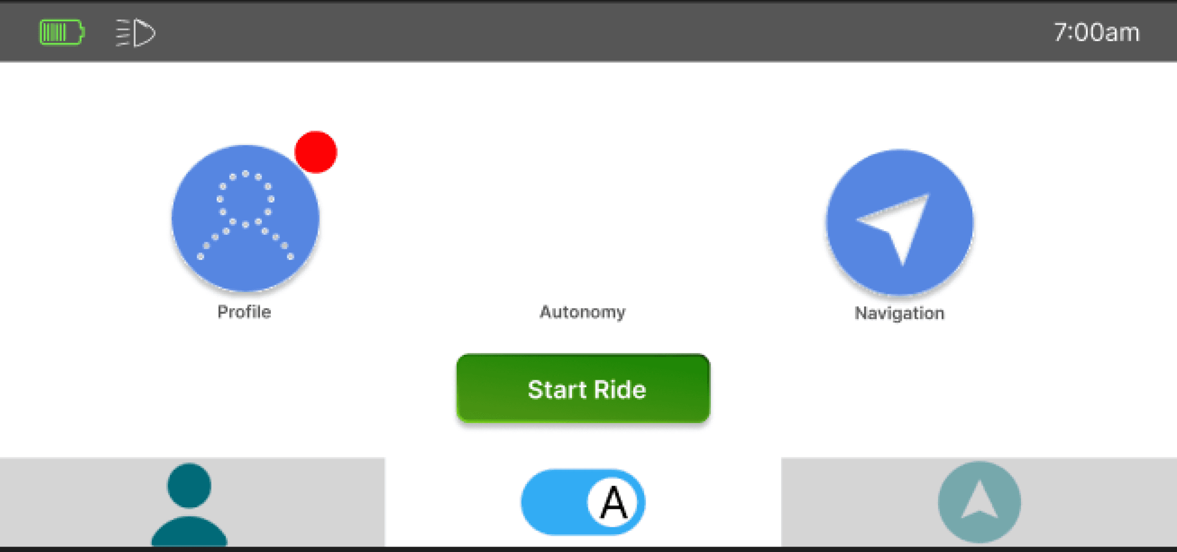
A
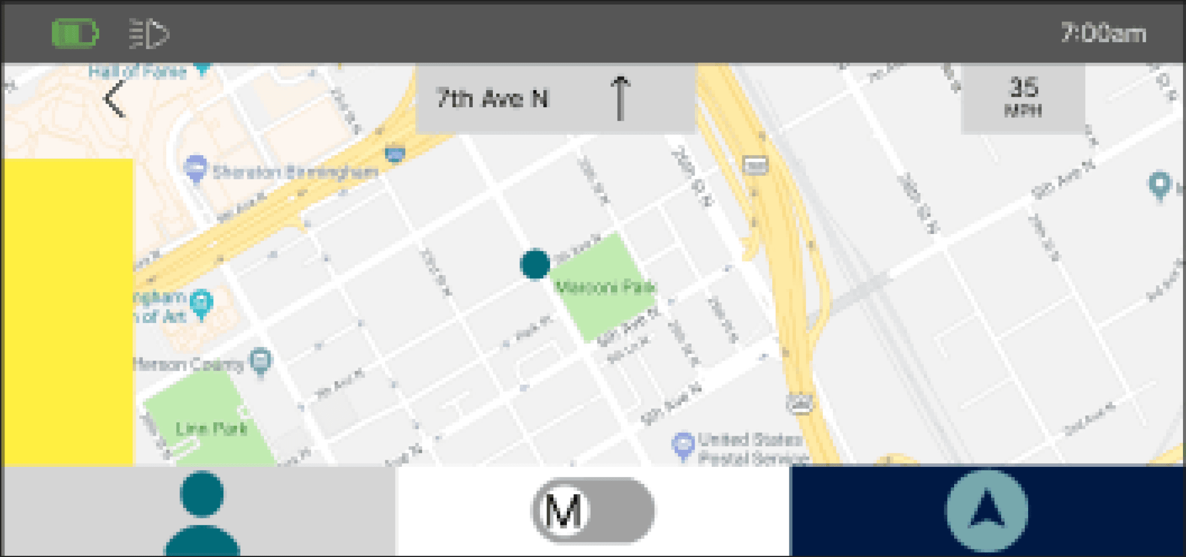
To provide users with an unobstructed view of the map and their current position, we positioned the navigation information and blindspot warning light along the edges of the available screen space.
In the dashboard profile screen, we incorporated user feedback by ensuring the alert and its associated action item were the main focus.
Aligning with our focus on safety, we added quick access to emergency contacts. I later raised concerns about privacy issues if others needed to access these features on behalf of the user, which led to further extraction of the visible information.

Key Challenges
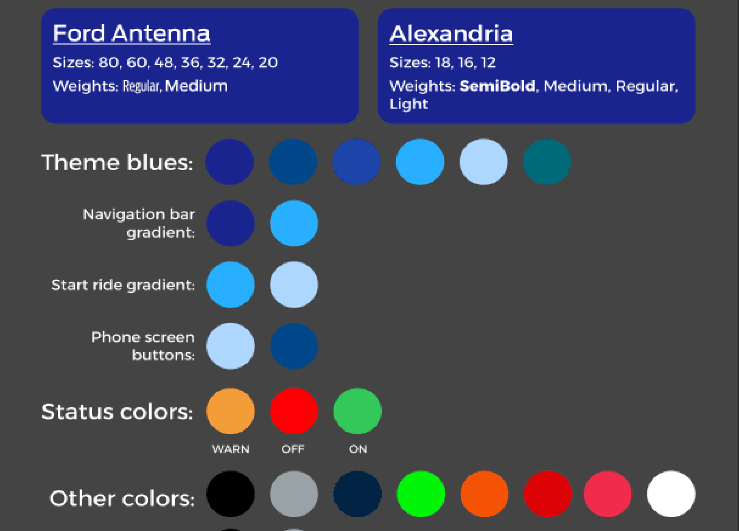
The biggest challenge was consistent font and color styling throughout.
During feature development and iteration, the original scheme was overlooked. I created and implemented the final scheme, aligning it with Ford's specifications and ensuring popups effectively captured user attention. While implementing the styling, I also refactored a teammate's work, restructuring it for clarity and introducing layout and grouping for organization.
Another challenge was clarifying the distinction between the app and dashboard.
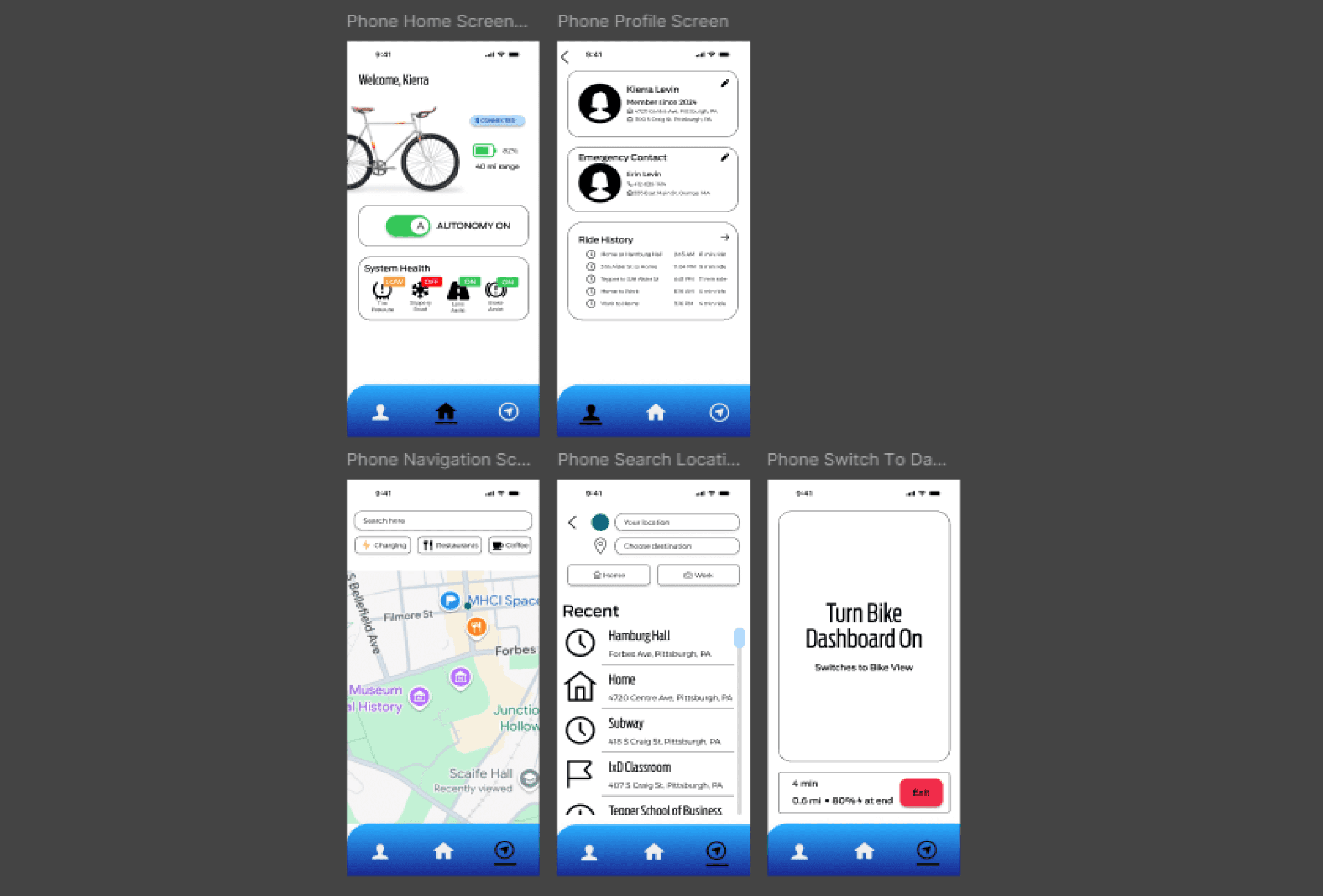
During user testing, we observed that the "Bike Dashboard View" confused users, who interpreted it as the mobile app's home screen instead of the turning the bike on. This feedback led us to refine the wording and adjust the screen layout to ensure a clearer, more intuitive transition.
Switch to Bike Dashboard View
Turn Bike Dashboard On
Switches to Bike View
Final Results
We redesigned the home screen to prioritize navigation and help. The Help section to provide clear guidance on autonomy and system symbols. Across all screens, I enhanced usability by applying shadows only to interactive elements. I also clarified system health statuses as static indicators based on testing feedback. On the navigation screen, I added an arrow for current direction, dotted lines to represent lane assist adjustments, and consolidated navigation information into a single area for ease of use.
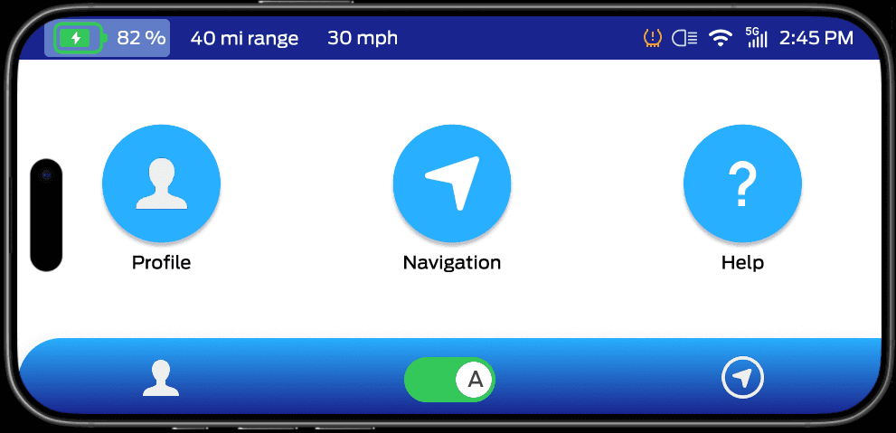
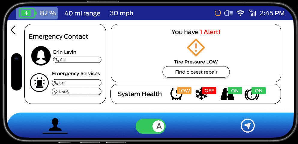
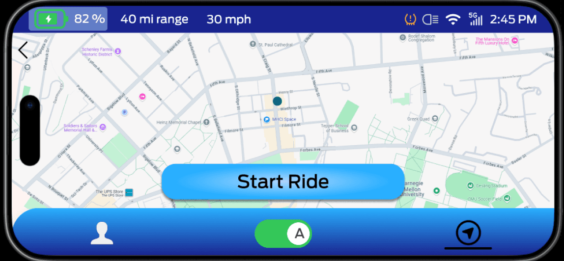
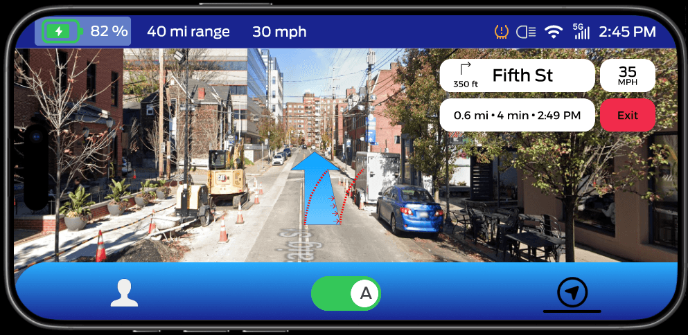
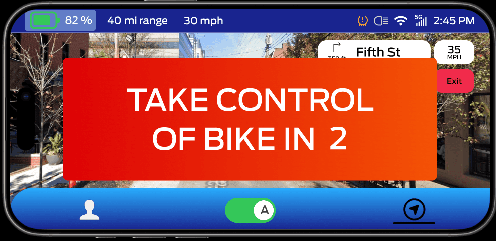
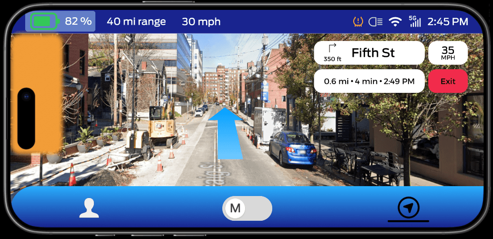
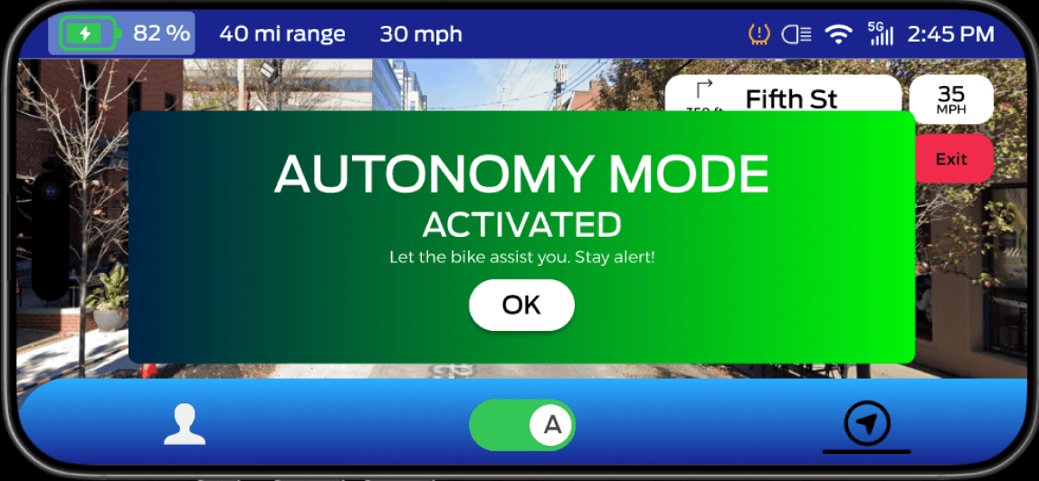
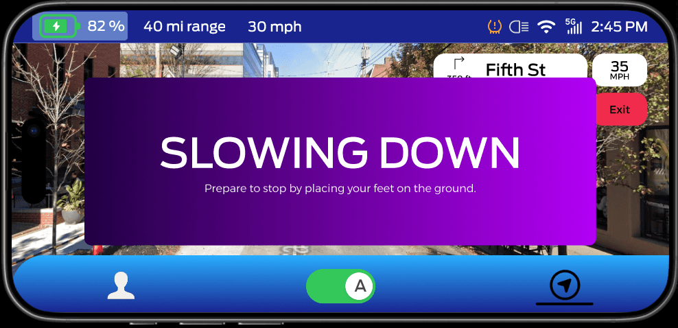
Based on user feedback, I implemented several enhancements to improve safety and usability. I ensured that the system automatically switches to manual mode following the "Take Control" popup, adding an animated countdown to guide users during the transition. To ensure critical information is acknowledged, I designed the mode popups to remain on-screen until the user acknowledges them. I also introduced a "Slowing Down" popup to keep users informed and safe during deceleration. Finally, I adjusted the color, shape, and position of the blind spot light to enhance visibility and maintain consistency across the interface.
Final Results Continued
Safety was our top priority, so we prominently featured system health alerts and emergency contacts. We also allowed users to personalize their experience through the profile page. For navigation, I streamlined the process with patterns resembling Google Maps' user interface, enabling users to input destinations via the phone app and use the bike dashboard for immediate ride interactions, minimizing distractions. We included real-time connectivity between the app and dashboard to provided users with visibility over battery life and autonomy status. Lastly, we incorporated ride logs for safety and convenience.
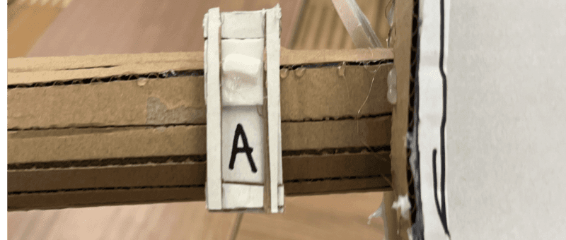
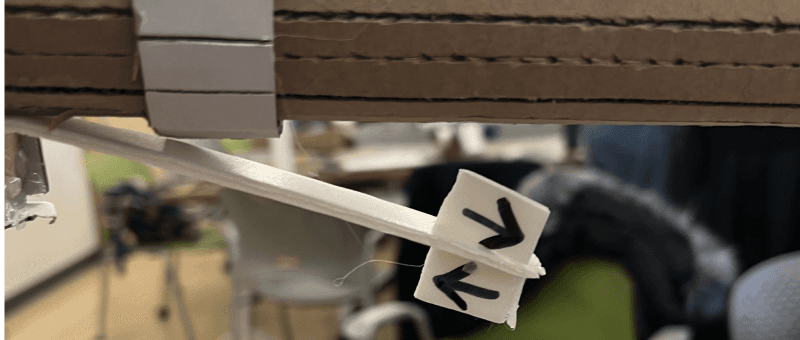
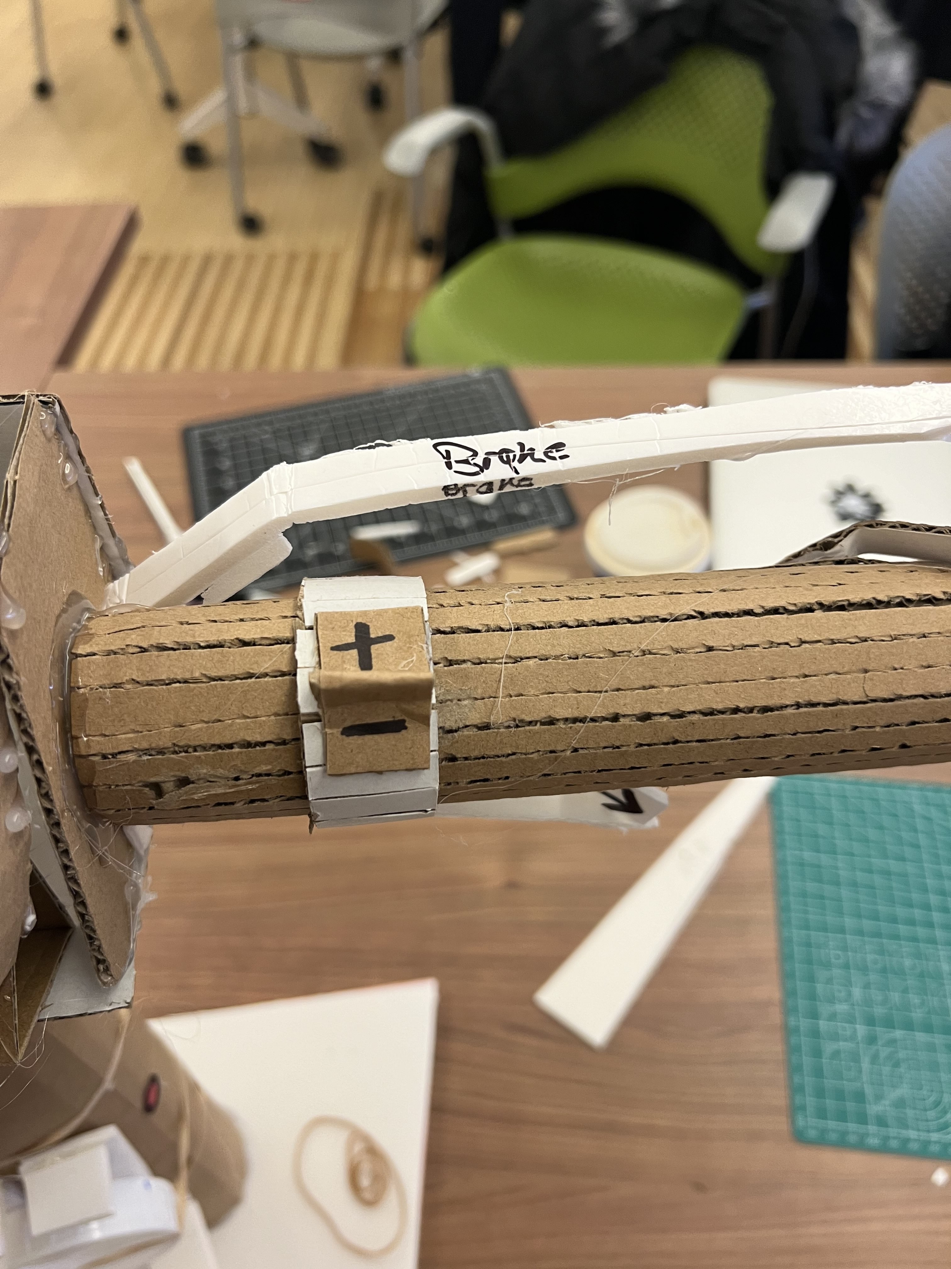
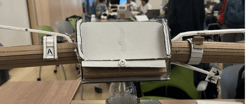
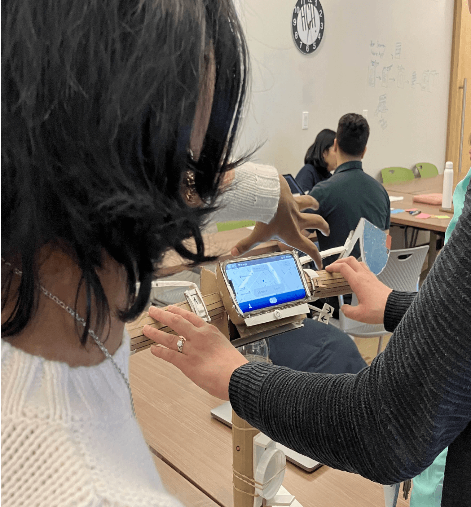
Based on feedback about confusion around the controls, we added clearer labels for all physical features. We also repositioned the autonomous toggle closer to the dashboard to reduce accidental adjustments. Drawing inspiration from car designs, we included a flickable turn indicator and an adjustable accelerator dial. Additionally, acting on user feedback from testing, we angled the screen to improve visibility during rides.
My Learnings
Physical design thinking
Designing physical bike controls emphasized the importance of human factors and pushed me to critically evaluate everyday features I've passively accepted in vehicles. This experience deepened my understanding of physical design and gave me the opportunity to apply design concepts (both from this class and previous coursework) in new and innovative ways.
2.
Taking risks in interaction design
This project encouraged me to take creative risks in designing the dashboard and phone screens. I had the freedom to experiment with Figma’s structure, ensuring a cohesive flow and intuitive interactions. This flexibility expanded my design approach and set the foundation for continuing to take bold risks in future projects.
3.
Managing team collaboration
Navigating team dynamics and varying skill levels, I took the lead in restructuring and organizing the work, while also guiding the team to ensure clarity and cohesion. This experience strengthened my leadership skills and emphasized the importance of clear communication and coordination within a team.